Quantcast
Channel: Interior Design Archives - Girvin | Strategic Branding & Design
Viewing all 60 articles
Browse latest View live

Designing the Processional Journey | Retail strategies of sensation management

$
0
0

Designing the Processional Journey | Retail strategies of sensation management
The layering of textured sensation at Comme des Garçons | Dover Street Market | NYC

In one’s career, there are intersections,
points at which you make a crossroads crossing
you come into the intersection going one way, and you leave that, as crossing guard,
transecting into a new path.

Crossroads are full of magic.
Worlds churn there, and yes,
while there is this street and that street,
surely there are more roads coming to this nexus than you might know.

And if you live in that matrix of roads, knots, unknowing, uncertainty and risk — it will never be easy,
like a swarm of snakes,
there will be interlacement.
There are points by which the sheer tenacity,
the passionate fury is so anvil-tempered and roiling with heat that you wonder —
“how has this person stayed on fire for so long?”

Rei Kawakubo might be one of those
impassioned flame-throwers,
who’s perpetually on the edge of
a newly-tipped point of wisdom, a new quiet insight,
that she rips all wide open in the risk for.

Some might simply say —
“she knows where she’s going
and she’s just going there.”

I’ve always been looking at, and for, people
of that molded, hot-poured crucible.

Life for them is never easy,
and it’s not sup-posed to be, either.
As a journeyer, it’s what you’ve seen, where you have been,
and who you have met that tells the tale
of living well, deeply, widely and wisely.
Some might comment — really, has Rei Kawakubo been so wise?
She’s been described as a perpetual apple cart spiller.
With what others have so neatly arranged in their retail retellings,
Kawakubo-san simply upsets, spills and finds
a new arrangement in the spilled raiment of goods strewn wide and wild.

Kawakubo | Irving Penn 1993
Designing the Processional Journey | Retail strategies of sensation management

What that
boasts
is joy.

Joy
in
the celebration
of experience.

Joy in sharing — it’s never “humdrum, get it done.”

It’s more — “how could we do something really magical, and create a village of cobbled-together micro stores, like some caravanserai of the imagination — fun, child-like, revolutionary and rebellious.
Interesting to categorize a 71-[2014]-year- old woman as rambunctious.
But it works.

I went to her new installation in NYC.
And walked and
shot the floors.

What I found was a riot of color, texture, amazement and whimsical amusement.
My first thought —
“someone loved this place.”
And made this place, with
love,
care,
attention
and intention.

There, she’s taken over a whole building,
all seven floors a
celebration of her
curious and collective mind.

Imagery, here.

Designing the Processional Journey | Retail strategies of sensation management

Right here,
30th & Lexington

Designing the Processional Journey | Retail strategies of sensation management

Invent upon it,
as you will.

A journey worth taking,
a procession from the street to the imaginings of
the marvelous — knit-wrung pillars, scrap heaps of assemblage, a melange of invention, play and exploration.

A delight — along with food on the main floor.

Truly a sensational design program, all senses — noted and examined,
savored and flourishing in a riot of materials.

Our explorations of her work,
a journey years in our making,
can be found, here.

TIM | GIRVIN NYC
…..

THE STRATEGY OF IMAGINATION +
EXPERIENCE = PLACE

DESIGNING ENVIRONMENTS:
PLACES | RETAIL | RESTAURANTS | SPAS + WELLNESS CENTERS


Can you get thru?

$
0
0

Can you get thru?
The inward and outward flow of brand experience design.

I was trying to make a connection with a team, a brand, and — like most of you — I was on-hold, then waiting, then holding, then waiting — and finally; and
I was passed along to another, who had no clue about my call.
In a manner, the idea of thru-ness and through-put of experience design, it’s always about the layering of pathways. And how is the experiencer allowed to link to their own sense of touching points in their journeying; and two how we, as designers,
might be guided to
see,
touch,
and experience.

I come in.
I go here.
Your design points me there.
Your notations in sensuality
the sensationalist strategy of experience —
will set trans-sensational pathways for
how the experiencer
will transit in the clarity of place-making
and the resolution of visioning.
Touch, taste, scent, sound, sight
will become clearer.

To the notion of through put, what if everything is wired to sensationally link? What could that represent, to strategy. We see this already in the layering of digital connectivity in retail design. And like the ads calling out in movies like iRobot, or Minority Report where fugitives can’t hide, ad venues recognize them transiting through their scanning space and advertorial messages are pushed at them.

That visioning to content could be found in this modeling, bearing in mind that simply to view this visualization you will have to push through a barrage of advertising, shielding your journey to this one idea.

Can you get thru?

But — can you get through, if you’re being pushed?
A question.
Can you get thru?

Tim | GIRVIN | Pike Place Studios
—-
Girvin Cloudmind | http://bit.ly/eToSYp
TEAM-BUILT STRATEGIC INNOVATION WORKSHOPS

Designing Spiritual Spaces

$
0
0

SPIRITSP[L]ACE

Designing Spiritual Spaces

WHERE HAVE YOU BEEN THAT IS THE MOST PROFOUNDLY POWERFUL, SPIRITUALLY RIVEN, MAGNETICALLY CAPTIVATING PLACE?

WHAT’S UNFORGETTABLE?

Some know about my experiences, early on, bringing artist / designer James Turrell to Seattle, as a COCA board member, [#makeamericacreateagain].

This was during the 80s, a widely-visited installation in an abandoned building in Pioneer Square. It was a team of four of us that pulled the plan, the money, together.

It had to do with what could be seen and sensed, and what could not — the quasi-reality of perceived luminosity in grasping spatial context.

After all, we designed a silkscreened posters to call a string of events to mind — talks, placemaking, exhibits.

Designing Spiritual Spaces

It led me to a kind of lifelong study of Turrell’s work, and a handful of other artists building site-based experiences of art and light, perception, vacuity, opacity, translucency.

Light-designed hospitality?

Designing Spiritual Spaces

You know Turrell, right?
And during that selfsame time — mid-eighties, we had brought Robert Irwin, a Turrell compatriot and designer of mischievous places, made,
to speak in Seattle.
His book, a life-changer for artists.

My notes, wandering, here.

Explore this, when
you have a moment.

Designing Spiritual Spaces

From Matisse to Turrell, 8 Artists Who Designed Transcendent Chapels
BY ALEXANDRA ALEXA

The point is, if you’re making something,
“what’s the point?”

Why are you doing what you’re doing?
Is there something more?
Surely,
there
is
.

Tim | GIRVINWATERFRONT

––––
Rethinking Beauty:
Brand Strategy & Visualization
Girvin BrandJourneys®

http://bit.ly/1sSgbOB

*EXPERIENTIALITY: HOLISTIC EXPERIENCE DESIGN AND SENSATIONALISM FOR BRANDED PLACEMAKING

$
0
0

The Strategy of *Experientiality — Holistic Experience Design for Restaurants
Thinking processes for experience
design strategy and deployment

During the 1990-early 2000s, I spent time working with the Disney Imagineers and Park Strategists at Disneyland — designing experiences, brands and their integrated strategies in Orlando and Anaheim. As well, during that time, we worked with Steve and Elaine Wynn on Bellagio and their teams and properties. All sides, I learned a lot about design thinking — the planning of holistic renderings of journey, queue, storytelling, graphical elements — and how it all fits together.

When you consider it, sensational design — designing for the senses — restaurants are the best platform for complex, integrated holistic engagement.

These studies range from intimate and close-in, managed entertainment affairs and queue-based experiences, to guest enchantment at sit-down as well as wandering explorers of varied food experience options.

Many times in my career, I was drawn into realms of brand work and design, that I was curious about, but didn’t have much experience. I wandered in.

B R A N D D R I V E
What that range of design learning taught me — specific to dining offerings in design, strategy and procession, is that a restaurant visionary will need to have a clear visioning about the core distinction of the proposition of value and exchange — coupled in the passion of what drives that person, the restaurant’s leadership and their teams. Leadership will be about participation and involvement. That’s a key — who is there, managing the team, who inspires, who fires the drive of the brand?

WHAT ABOUT YOU?
What are your key offers answering the question as to why a person would like to be there — this place that you are making? Simple question — it’s the why.
Why should we do this?
What difference are we offering?
More seats? Special foods? Preparations? Environment? Spectacle?

Everything comes back to
intention, which drives attention and attraction.
People are enticed to an offering —
they come, they explore, they savor, they stay, they go.

We call it
the E’s:

They are
enchanted —
the song, the chant, of the offering is a compelling expression, magnetism happens.
The drawing nigh begins.

There is
engagement.
After a sense of magnetism and vibrational attraction
[“I like the vibe of this place, feels good, I get it…”]
There is commitment — the story will be shared.

There is
embracement.
There is the offer of a gift and there is a recipient of that gift. And a price might be paid for that exchange.
The equation comes to:
what is your intention?
And what is your gift?

The Strategy of *Experientiality — Holistic Experience Design for Restaurants

We think of journeys as pathways and labyrinths —
which is a sequencing, a spiral of brand experience design:
GIRVIN’s red thread of connective analyses
that is, if you’re thinking about creating a restaurant or any type of brand experience offering, think deep first.

Go soul.

Go spirit.

Then plan
and build. All builds start with a dream. They must have that foundational mysticism: the dream, the idea[l], the vision and out there — the actualization.

Working for years on the propositions of food experience — from luxury dining to kiosk service, fast casual to white tablecloth, we have a legacy of searching for the engagement tools for guests, building in a certain set of experiential devices in analyzing the success of brand storytelling and experiencer relationships in dining design.

What kind of restaurant could you be?

You could start simple, faster, more accelerated service: fast casual, as noted below —this journeying and watch-fullness sets the foundation for consideration of your ideal.

Or, go complex.

Or go towards some other admixture.

But go deep,
to passion,
your deepest commitment,
the drive.

If you’re creating a restaurant, you’ll need to clarify and respond to this question: are you building a proposition of something quick and accessible, or a more complex table service?

Let’s start with one, the notion of a speedier brand storytelling. There’s a distinction, between the conceptions of fast casual [FCR] and QSR — quick serve restauarants. And the processing purports formulae to dollars spent, interior character and brand environment.

Go fast: foundational rules
of the dining experience strategy —
QSR, fast casual,
or upscale potential environments

The basic rules of the road apply across the field of experience planning

• Food will be, and always shall be: everything. Without great food, the restaurant will be building an audience of unstable relationships. The community won’t be connected. No high-flying design will save a restaurant without great product. Money aside, the relationship to customers will be superficial and weak.

• Sequences of action.
The real procession — far-out to close-in, walk-in: being served, leaving happy — this is fundamental, but oftentimes ignored. How does that work — how would you manage the journey of *experientiality?

• The core standards
of the connection between the team and guest is another proposition. How was that sequence managed — what’s the greeting, what’s the differentiation,
what is, where is, the sincerity?

• Care — who cares, really?

The idea of care is a permeation that needs to stretch everywhere in the experience planning —
but how is it managed?

• The sense of place
so much of fast casual (which might be anything from a Starbucks to Chipotle, relates to pricing and time — budgeting per serve are roughly $7.50 — 11.00. The items can be less, but the potential strives for multiple turns in the day’s meal cycles.

How might this be analyzed?

Sequentially.
In our expertise, the idea of sorting process and epiphanic moments could be synchronized to a step-by-stride, instant-to-instance, moment-to-momentum:
the dance of the practice.

And practice — it is — makes perfect.

In analyzing literally dozens of fast casual experiences, there are learnings:

• Brand is crucial
it’s obvious what this place is.
Considered and comprehensive?
You stand for something,
there is a badge that says who you are.

• Story is comprehensible
tell the consumer, fast,
what the story is.
Don’t make them work for it —
find ways to tell it, signing
and graphics, menus and mobile,
websites and print offerings.

• Process is fluent
the guest can get into the place,
through the server line and
orders shall be resolved efficiently.
Served up.

• If they can stay, how long?
timing the sequence,
for stay,
for work,
the third place,
respite,
meal and out,
drink and connect.
Has this been designed?

• The market, the community of your audiences
knowing your market,
the competition thoroughly,
who’s winning and how they are evolving —
good inquiry to examine.
Asking this question — are you up to speed
with who’s out there?

D E F I N I N G   I N Q U I R Y   |   S E T T I N G
T H E   H I G H E R   I D E A L

We define: establishing Brand benchmarks
will establish consistency and clarity,
which is important in times of growth,
when money is being spent and decisions are crucial.
A consistent Brand,
coupled with individual location distinction,
appears stronger to consumers and investors,
ensuring confidence to buy.

EXTENSIBILITY
THE BRAND FOUNDATION:
WORKING SYSTEMS
CORPORATE BUSINESS PAPERS

Standardized system for all corporate documents including: business card, letterhead, #10 envelope, large size envelope, mailing label and forms such as invoices and Word templates for letterhead. Building digital forms for email is another cohesion to brand lineage.

WHAT’S IN FRONT
SHOULD BE CONSISTENT:
BACK OF HOUSE COLLATERAL

Employee schedule, employment applications, inventory, morale boosting and messaging as well as other applicable forms — upfront one way, same on the back side.
BRINGING A HOLISTIC MESSAGE:
MEDIA KIT*
Brochure, delivery system, designed one-sheets.
The sensation of passion and wholeness are clear, what you stand for, what you’re like, what you mean — these are the resonant element of memorability.

LINKING CONTENT AND TRAINING TOOLS:
EMPLOYEE TRAINING MATERIALS*

New trainee folder, unique welcome gift, “For a Friend” coupon. Designed one-sheets w/ training information. Brochures and overview.
*Could be combined into one kit.

INTEGRATION OF STYLISTIC INTENT:
BRAND STYLE GUIDE

The Brand style guide is a manual for creative and marketing professionals, including vendors, for optimal consistency across a variety of applications. This guide includes configuration and exact specifications for use of the Brand Identity, including “do’s and don’t’s”; use of color and specifications;
type hierarchy and layout guidelines; guidelines for additional elements such as graphic and photographic styles. An expected deliverable is a reference manual in book and digital form.

OWNING THE LOOK:
ILLUSTRATION STYLE

An expected scope of strategy should include analyzing current and previous illustration styles and defining a consistent style that is most suitable to the Brand, reasonably moderate in budgeting and adaptable to various illustrators.

UNDERSTANDING THE MINDSET:
THE REASONING FOR INVOLVEMENT

A few of the core reasons why a person goes out to eat:
Hungry
(for new or reliably predictable experiences).

There is
nothing to eat
in the house
(speed and convenience).

It’s routine
(the habitual relationship).

Going with others
(an ongoing interaction).

Meeting othersa place
(the nexus).

THE RUDIMENTS OF ANALYSES |
HOW TO PLAN

It’s important to bear in mind that the process for sequencing brand experience is one of complex detailing — these graphical discussions merely pinpoint the opening arcs of each phase of development — how you think about it, how you’re telling your story.

There are myriad points of connection to a community relationship and they’re not only inside the walls of the enterprise, but to the employees and their families, and the importance of the surrounding community.
–––––––––––––––––––––––––––––––––
A PRELIMINARY
STRATEGIC OVERVIEW

Creating a cartography or mapping of restaurant experiences — the complexity of engagements is a good foundational checklist — designing this as a kind of gathering of all the possibilities of encounters, perceptions and points of brand management builds the basic layer for how to see what potentials there could be in any study, for any type of restaurant. For this grid, our fast casual circling — the red thread of brand embracement — the centerpoint of the symbolic allegory is a “burger” icon (for the basic offering of one client relationship that used this methodology.)
The Strategy of *Experientiality — Holistic Experience Design for Restaurants
STAGGERING THE EXPERIENCE TOUCHPOINTS |
THE RHYTHM OF SPECTACLE

The process of connecting, or disconnecting, with guests is made on many layers of contact — break one and you might break them all. One grand experience can be quickly dispelled in a break of the happy sequence of attractive actions. It’s always that challenge, sequencing discovery and attention must be paid to the intention
of the brand and its offering.

Think like a guest.
What happens?
The Strategy of *Experientiality — Holistic Experience Design for Restaurants
THE EQUATION OF GOODNESS |
AN ENLARGED PHILOSOPHY

We’ve explored the idea of goodness — this reaches to the notion of good experiences — but as well the value of the guest relationship and finally how that equates to the community — doing right,
doing good is a one-on-one experience,
as well as one —
your brand
to community.
The Strategy of *Experientiality — Holistic Experience Design for Restaurants
How does your guest
own their place —
at your place?

The Strategy of *Experientiality — Holistic Experience Design for Restaurants
X MARKS THE TOUCHPOINT |
CLUSTERING SENSATE STORYTELLING MOMENTS

In this sequence of images, the idea of the touchpoint is something that is defined as the x – marking the spot of the sequence of connections in procession — the literal process for how guests encounter the presence of your brand. Brand presence, to our thinking, relates to “being present,” awakened and alive — vitally “on.”
In all ways: on.

The Strategy of *Experientiality — Holistic Experience Design for Restaurants
THE PROCESS OF ENGAGEMENT |
THE PLEDGE OF COMMITMENT

Engagement, embracement, envelopment
in the brand experience
is something that isn’t just inside the doors — it can begin blocks away as messaging potentials present themselves. And the etymological reference to “engage” is literally to pledge. And to that reference — what is your promise, your pledge?
Each one of these “ripples in the ring” should be considered — point: signing, point: drivethrough, point: standard, point: your front door, entry, point: merchandising, menu and window messaging and offering visualizations. All synchronous — casually observed by the guest in transition, but powerful in its holistic mechanism.

The Strategy of *Experientiality — Holistic Experience Design for Restaurants
THE ENTRY SEQUENCING |
THE JOURNEY BEGINS

The entry is the beginnings of the close encounter, team members come into proximity, small messaging begins to build, as well as enlarged layers of storytelling. Everything that the brand does is about telling a story — greater, or smaller, a detail in the movement of the guest into the closest proximal relationship to brand place. Everything is a story — and the question relates: “what’s your story — and how will you be telling it?”

The Strategy of *Experientiality — Holistic Experience Design for Restaurants
THE INTERNAL PROCESSION |
NAVIGATION

Lines happen — volume suggests action, so the play of the line and parlaying that as a decision-making process will be important. But will this sequencing might be only about storytelling the product, or building the layering of the brand experience — in that storytelling. While classic fast casual strategy mostly suggests raw product portrayal, there are other potentials — history, heritage imagery, ideals and attributes, community involvement, vendors and relationships — the scene could be rife with additives. Build strategically, that sequence — think Disney, Universal Studios or other entertainments. Small, or large, the messaging can count — especially if people are waiting. Tell your story, show the betterment of what they came for, enticement shall magnetize.

The Strategy of *Experientiality — Holistic Experience Design for Restaurants
THE COUNTER ENCOUNTER |
LESSONS LEARNED

The propositions of face-to-face connectivity are priceless — and they can account for the win, or the lose, of the entire relationship. Anyone who’s ever had an expert experience in a restaurant, inside or out, employee or guest will know this intimately. If this could be won — and practiced happily — everyone succeeds. But that’s only part (and a very significant part) of the engagement — more messaging ensues and the dramatic, powerfully accessible, comprehensibly appetizing this process is, the better. In our experience, the notion of dramatic photography isn’t the only measure of success — fast clarity, careful messaging and explanation
are just as vital.
Be social.

The Strategy of *Experientiality — Holistic Experience Design for Restaurants
INTERNAL CIRCULATION |
WHAT PROOF CAN BE FOUND?

Up and about, guests circulate — what is the expanse of the brand storytelling? The landscape should support a sense of the authenticity of the statement; it’s not a hollow premise. Experience counts just before, and just after the meal — exploring the place, there can be added layers of messaging to build on the depth of the story. People will read-in if you purport dimensionality of brand storytelling and layering of expressions to the truth of your potentiality. It’s not the same old — it’s a song with different melodies — catching the drift of the tune builds expansiveness of experience detailing.

The Strategy of *Experientiality — Holistic Experience Design for Restaurants
THE SENSE OF THE TABLE |
THE CARTOGRAPHY OF ARRANGEMENT

A sight for hungry eyes — food, packaged, branded messaging, storytelling on the wrap, table amendments — amenities can offer the touch of another point of experience envelopment. That point — the “containment” is the same as embracement — the guest is enveloped in the meal, the taste, scent, sight, touch, sound of that prize — it’s why they are fundamentally here.

The Strategy of *Experientiality — Holistic Experience Design for Restaurants
ANALYZING THE GATHERING OF POTENTIALS |
THE BALANCE

As noted in the beginnings, the positives and negatives of the experience can be shining wonders to grand times — any moment, potentially disarmed by a wayward, brand “off” encounter. It all adds up, or down — it’s up to the management of the brand to make it sing.

The Strategy of *Experientiality — Holistic Experience Design for Restaurants
THE CLOSURE |
THE SEND OFF

What’s the good bye?

The Strategy of *Experientiality — Holistic Experience Design for Restaurants
THE SOUL OF PLACE |
BRANDS AND EXPERIENCES BUILT BY HUMANS

In the opening imagery, we offered the notion of the red thread of experience layering; but any brand will start with the soul of its foundation — the people that are inspired to make the offering — that could be the visioning of the founder, or it could be a team-envisioned dream. But the soulful nature of any proposition shall speak to the potency of nurturing the cult and enculturation of those values. There needs to be a tenet of intention, which builds attention and catalyzes attraction.

People are people; they make things.

The Strategy of *Experientiality — Holistic Experience Design for Restaurants

Tim Girvin | Drafted at Harbor, Schaumberg, Illinois
Project Context:

http://goo.gl/0i0Hj8

*Experientiality — design thinking founded on a multi-sensory strategy of experience development: integrated holism.

THE CODE OF THE MESSAGE | THE DESIGN OF THE ALPHABET

$
0
0

THE CODE OF THE MESSAGE | THE DESIGN OF THE ALPHABET

THE ILLUSTRATION OF THE MIND: FROM THOUGHT TO WORD IN DESIGNED LETTERFORM LINGUISTICS | ALPHABETS AS BRAND VOCABULARIES.

Working on hundreds of logos and corporate identity packages, in decades of design and brand development for clients around the world, over time there are learnings to the hidden code of the alphabet, and how that applies to identity theory.

How do you think about a simple letter,
a piece of type?
What is the impact on design strategy and thinking?
Holism. Integration. Recognizable style. Seamless reflection of a dynamically whole brand presence.

And why not design your own, link identity to a systemic alphabetical formulary?

You think about the alphabet as made up of two key elements: as a vertical stroke and a circular rendering — the interface of the I and the O, or the i and the o which set the pace for the entire alphabet, it’s the detailing of the rhythm of geometry.

For years, in designing identity programs, we’ve thought about how that could play out to a campaign, a font system, print graphics, signing and environmental graphics, packaging systems and product naming; it all flows out from
the inspiration of the idea
and the core littera principia of the alphabet:
the
i
&
o.

THE CODE OF THE MESSAGE | THE DESIGN OF THE ALPHABET

In our weekly type design and calligraphy classes at Girvin,
we always start out with —
“what’s the I,
and what’s the O —
what are the details of their structuring
and how does that work
for the alphabet as a
rhythmic system of movements?”

Inside those two letters are the fabric,
the brandcode®,
of an entire design language.

Designing a logo, then speaks the question:
“how ownable is this design, how protectable is it?”

Build a customized rendering, and a font that goes along with it,
and yes —
it’s even more registrable.
You own it because it’s yours.
It’s just for you.

The hand, with mind and meditation, starts that journey.
When you think of a brand, a person, a word — what comes to mind?
Could you just draw it out?

THE CODE OF THE MESSAGE | THE DESIGN OF THE ALPHABET
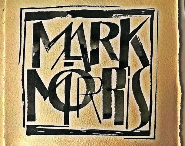
Poster | logotype for Mark Morris

Most of the history of type design at Girvin comes from a legacy of training in biology at NewCollege, working with Lloyd Reynolds at Reed College , working the limits of self-guided education at the Evergreen State College and then what I call Alphabet Odyssey in a adventuresome run to meet with designers in the UK, France, Switzerland, Austria and Germany, finalized in a speech on American Design in Moscow and Tallinn.

That was my beginning,
when I really didn’t know
what I was doing.
Just doing.
It.

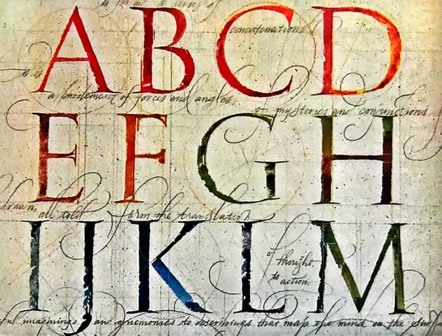
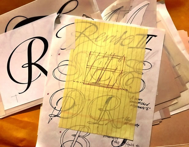
So, in rendering typographical concepts, I start with a familiarity in writing by hand — writing with the hand, setting the foundations. That might be on rough, handmade paper with notes.

THE CODE OF THE MESSAGE | THE DESIGN OF THE ALPHABET

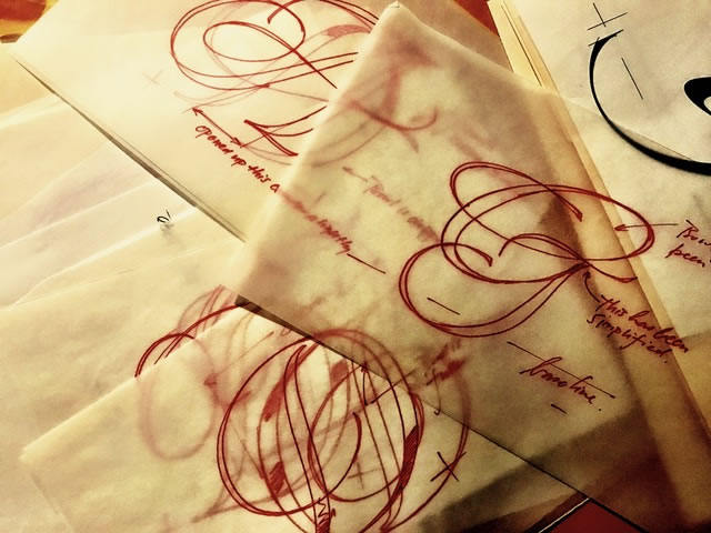
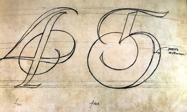
And that might be penciled, or penned renderings, starting as tracings — as in this foundation for a bejeweled font for Jewelry at Tiffanys, later demoted to a catalog font.
With, then CCO|Tiffanys, Susanne Manheimer.

THE CODE OF THE MESSAGE | THE DESIGN OF THE ALPHABET

You start, then restart, then tune, then revise.
THE CODE OF THE MESSAGE | THE DESIGN OF THE ALPHABET

Any rendering —
from tracing to formalized ideation,
eventually finds ink in its making.

THE CODE OF THE MESSAGE | THE DESIGN OF THE ALPHABET

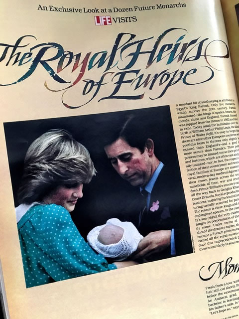
Part of my earlier history was working
with Bob Ciano at Life Magazine.

That working collaboration was calligraphy, custom type, photographic folios, initials and rubrics —
spread by spread, page by page.

THE CODE OF THE MESSAGE | THE DESIGN OF THE ALPHABET

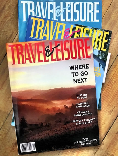
I’d work with him at the HQ of the Time|Life publishing group in NYC and we’d build treatments, design ideas, calligraphy and lettering design for the publications. I worked with him in a string of design developments over many years — and finally, on the design programs for Travel&Leisure.

Again, custom font, font system.
THE CODE OF THE MESSAGE | THE DESIGN OF THE ALPHABET

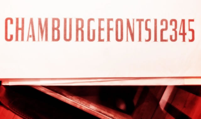
These started as sketches, then typographical kerning studies
and finally converted to film formatting for headline testing.
You can see how it works.

Conceptual sketching and form studies.
THE CODE OF THE MESSAGE | THE DESIGN OF THE ALPHABETg
Kerning breaks.
THE CODE OF THE MESSAGE | THE DESIGN OF THE ALPHABET

Larger studies [signing scale]
THE CODE OF THE MESSAGE | THE DESIGN OF THE ALPHABET

Film compositing rolls.
THE CODE OF THE MESSAGE | THE DESIGN OF THE ALPHABET

That led to a string of studies — building campaigns for Nordstrom —
one of my first retail design relationships —
my pitch to them, working on that brand before designing the Nordstrom logo and font system was about integrative deployment — 360º strategy;
to that, I designed signing and shopping bags.
And fonts.

THE CODE OF THE MESSAGE | THE DESIGN OF THE ALPHABET

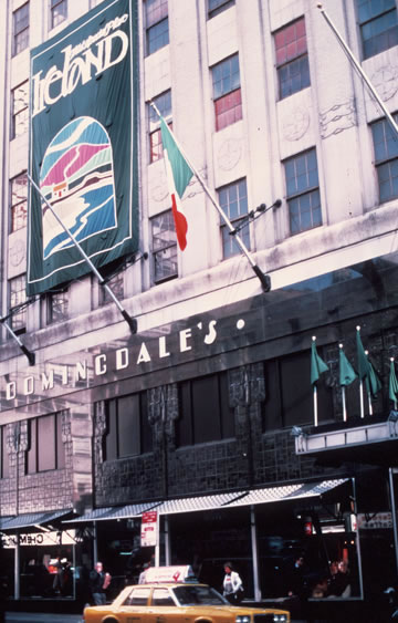
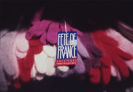
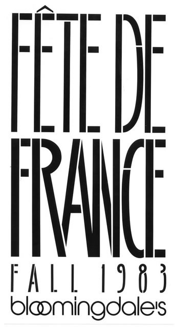
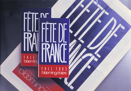
That led to John Jay and working with him
for nearly a decade on design collaborations in NYC,
the most obstreperous of which would be
the major fortnight campaigns that were
Marvin Traub’s
gift to the city of Manhattan
as gala Bloomingdale’s events.

THE CODE OF THE MESSAGE | THE DESIGN OF THE ALPHABET

A GALLERY OF CAMPAIGNS | CUSTOMIZED GIRVIN ALPHABETS
AND IDENTITIES FOR BLOOMINGDALE’S

FRANCE | Bloomingdale’s NYC
THE CODE OF THE MESSAGE | THE DESIGN OF THE ALPHABET

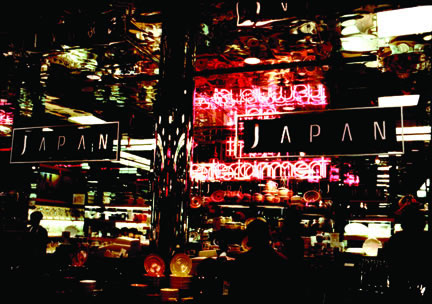
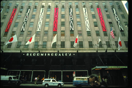
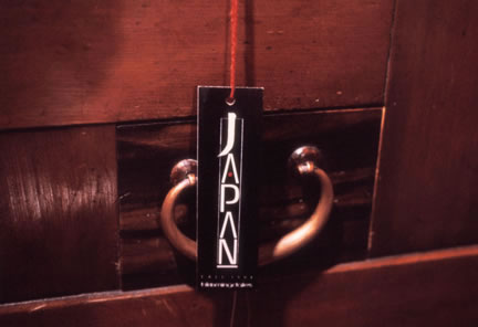
JAPAN | Bloomingdale’s NYC
THE CODE OF THE MESSAGE | THE DESIGN OF THE ALPHABET

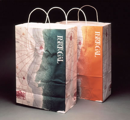
PORTUGAL | Bloomingdale’s NYC
THE CODE OF THE MESSAGE | THE DESIGN OF THE ALPHABET

SOUTH CHINA SEAS | Bloomingdale’s NYC
THE CODE OF THE MESSAGE | THE DESIGN OF THE ALPHABET

All of these campaigns involved customized fonts,
alphabets for signing, pop-up shops, restaurants, collateral, advertising and video.
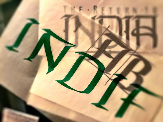
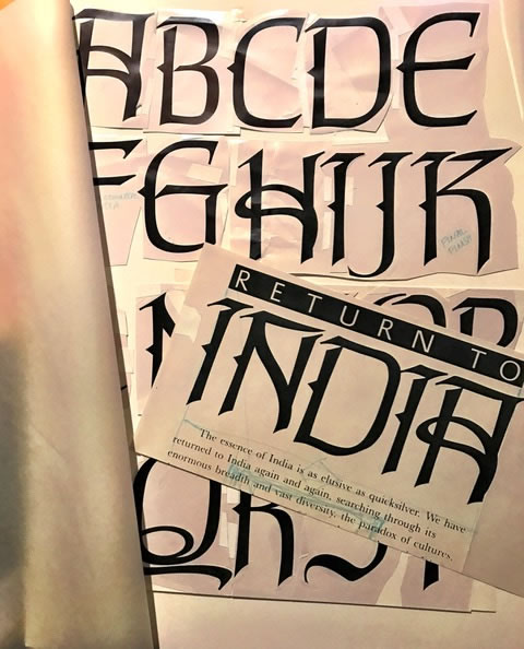
A font system for India — another campaign.

THE CODE OF THE MESSAGE | THE DESIGN OF THE ALPHABET

The other point to integration can lie in signing and the systems to support building branding — which is, literally, branding buildings: creating custom fonts that align with the brand, the architecture, etc.

THE CODE OF THE MESSAGE | THE DESIGN OF THE ALPHABET

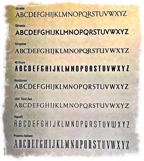
Here’s a rendering of a string of fonts designed by GIRVIN.

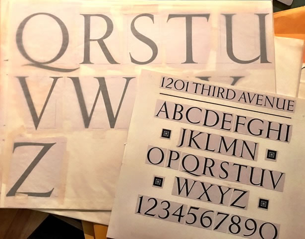
These are all project related and unavailable as purchasable fonts. They are — the GIRVIN corporate font; a font for FIFA’s posters, a inscriptional font for stone-cutting [a redraw of Eric Gill’s Perpetua], a titling font for CBS | 48 Hours, Nordstrom’s identity font and signing typography for departmental signage, a typeface for a neo classicist skyscraper in Seattle, a font for Michael Bierut and Massimo Vignelli, and finally, lastly, one of several campaign fonts for windows, shopping bags, merchandising and print advertising at Nordstrom.

THE CODE OF THE MESSAGE | THE DESIGN OF THE ALPHABET

It’s my belief that the alphabet is a transformational device, rooted in magical and mystical origins and, well-drawn, has unimaginable power.
Read.
Rejoice.
Wonder.
Weep.

Tim
––––
Crowdweaving innovation >
ideation, charrettes + brand events

Girvin BrandQuest® | goo.gl/yAquKQ

Go slo, mo.

$
0
0

Could you go slow?
Go slo, mo.
In the incipient need for speed
that rattles through the channels of our experience,
could that potentially
be
slowed
way
down
?
To see and sense more?

Take a moment.

When I travel, working on brands around the world, I try to come into a place slow.
Going slow, slowing my way in:
slowdown —
waiting in reception, chatting with visitors.

I take it in.

I watch others coming in.
I look at the floor,
I study the ceiling,
light
the walls,
the heat of the place.
the people moving in,
moving out.
Patterns and messages. Energy trails.

Flow, round.

Go slo, mo.

Watching slower means, of course,
that you have to be on,
and in,
time.

You really have to be early — get there, get anywhere,
to absorb the energies around you.
Being early, time will tell the quieter story.
Time, told.
That can’t be done,
except superficially, quickly.

As in studying a tableau,
a tapestry,
there is a granularity in the weave that is detailed —
that requires focus and care, intentionality of review.

Speed derails
that movement
of study.
Slow down, and you settle into the milieu.

You can see
them.

The players, the people
that are there, in symphony with their environment — cacophonous or harmonic.

Those flows count for something in the analytical notations of experience design strategy — gaggles of laughter tell a story, postures and the gait of people tells another story to freedom.
Faces.
And the eyes have it.

Slow down, observe more, stride more slowly
into the framing of place, people, light, movement and energy.

Details count.

Everything tells you something,
if you’re listening.

Tim | GIRVIN Queen Anne Studios

LUXURY BRAND STORYTELLING | THE TACTICAL STANDARDS OF LUXURY
BRAND STRATEGY, DEVELOPMENT + DESIGN

Girvin Strategic Luxury: http://bit.ly/NwMv46
Girvin Brand Luxe Thinking: http://bit.ly/gTW5HZ

Can you get thru?

$
0
0

Can you get thru?
The inward and outward flow of brand experience design.

I was trying to make a connection with a team, a brand, and — like most of you — I was on-hold, then waiting, then holding, then waiting — and finally; and
I was passed along to another, who had no clue about my call.
In a manner, the idea of thru-ness and through-put of experience design, it’s always about the layering of pathways. And how is the experiencer allowed to link to their own sense of touching points in their journeying; and two how we, as designers,
might be guided to
see,
touch,
and experience.

I come in.
I go here.
Your design points me there.
Your notations in sensuality
the sensationalist strategy of experience —
will set trans-sensational pathways for
how the experiencer
will transit in the clarity of place-making
and the resolution of visioning.
Touch, taste, scent, sound, sight
will become clearer.

To the notion of through put, what if everything is wired to sensationally link? What could that represent, to strategy. We see this already in the layering of digital connectivity in retail design. And like the ads calling out in movies like iRobot, or Minority Report where fugitives can’t hide, ad venues recognize them transiting through their scanning space and advertorial messages are pushed at them.

That visioning to content could be found in this modeling, bearing in mind that simply to view this visualization you will have to push through a barrage of advertising, shielding your journey to this one idea.

Can you get thru?

But — can you get through, if you’re being pushed?
A question.
Can you get thru?

Tim | GIRVIN | Pike Place Studios
—-
Girvin Cloudmind | http://bit.ly/eToSYp
TEAM-BUILT STRATEGIC INNOVATION WORKSHOPS

The First International Nordstrom Store | Calgary

$
0
0

The First International  Nordstrom Store | Calgary

Exploring Retail Architecture, Metaphor and Magic.

I had a chance to observe the strategic evolutions of Nordstrom’s brand presence in my friendship with Dawn A. Clark, AIA LeedAP — lead architectural strategist and team leader in the newly evolving architectural and store design expressions of Nordstrom — most recently unveiled and launched last week in Calgary, Alberta —
the first international store of
the New Nordstrom.

Any store is a story — it’s about hundreds of people driving, as a collective team, to a strategic direction — and the tactical outcomes in selling experiences, products, relationships and holistic services.

To get there, a direction needs to be defined, and it was Dawn’s visioning, along with the Nordstrom family, her teams of designers, as well as their long-running architectural retail design consultant, Callison — to look towards a layered string of metaphors to build out a dimensional experience of Nordstrom service. A customer’s impressions will always be about the detailing of sentience in procession — the “process” of accessing the street views, building skins, doorways, entry points, multiple floor access and departmental areas. While we had no involvement, in particular, with this store, GIRVIN designed the environmental graphics theory, interior signing systems, a specialized identity and alphabet for the Nordstrom family several decades in play.

Core to Dawn’s poetical design thinking is
a dynamic reaching out to bigger allegorical plays,
in place-making.
In my conversations with her about the notion of layering experience, she has foreseen the strategy of the New Nordstrom has one of a kind of stratigraphical expression, that finds its storytelling, like the journey into a canyon of stone stratum — the measurement of time, use, and materiality in a rich sequencing of retail presence. Looking at the stone patterning of the skin of the store underlines that opening premise — a strata strategy of variegated stone panels that stagger and tier in their arrangement in a manner that suggests a stamped compression that too speaks to a lightness and sliding airiness that strikingly energizes and modernizes the spirit of the shopfront.

The First International  Nordstrom Store | Calgary

The logo letterspaces its telling across these sedimentary markers, an earthen-like cleavage of stone, the stratigraphical beginning of a journey within.
At entry level, a glass chamber is fretted with a ruled patterning that extends the brand rhythm of layered dimensionality

The First International  Nordstrom Store | Calgary

The First International  Nordstrom Store | Calgary

The First International  Nordstrom Store | Calgary

The First International  Nordstrom Store | Calgary

That story finds a continuation in a vast interior well — also canyon-like — a vaulted chamber that uses light and materials to layer a luminous chamber from the exterior ceiling opened sunlight, down through the floors to the first floor foundation of the entry journey of Nordstrom customers.

The First International  Nordstrom Store | Calgary

The First International  Nordstrom Store | Calgary

There are other metaphors, of trees, of clouds — a stand of trees acts as a kind of merchandising storytelling. They reach out to a set of ceiling lowering and floating clouds — large scale panels that act as gestures of closeness and containment of customers.

See below, these statements of retail retelling.

The trees.
The First International  Nordstrom Store | Calgary

The Clouds.
The First International  Nordstrom Store | Calgary

There are already a number of overviews on
the first New International Nordstrom.
Explore local and international coverage as you will.

There are, too, studies and retellings of launch procedures of a store, and story, opening to a community — how does it happen?

People empower launches —
presence is authenticating, vitalizing and enchanting.
And the Nordstrom family sees itself as the foundational base of a pyramidal geometry of greatness — they support the staff. To the strata strategy of Dawn Clark’s retail architectural metaphor, the Nordstrom family are the core on which everything is built — the earthen requisite of an ever-growing and ever-greening garden.

Dawn Clark and Pete Nordstrom,
with Tom Ackerman

The First International  Nordstrom Store | Calgary

Dawn Clark with Jim Pattison
and Blake Nordstrom

The First International  Nordstrom Store | Calgary

For the Nordstrom clan, it is one of engagement — personal reaches and connections
with people, actively answering questions.
And here, Nordstrom family members talk to team members, to guests, to customers —
which in a manner of thinking, might all be in the same threading of care.

The First International  Nordstrom Store | Calgary

Calgary Store Manager Sheila Wooldridge, Bruce Nordstrom and Dawn Clark
The First International  Nordstrom Store | Calgary

What is engagement, for a retailer?
Listening.
Watching.
Learning.
Changing.

Erik Nordstrom, answering questions about shopping bags and where to get them.
The First International  Nordstrom Store | Calgary

Engagement is about touch [and, in the original etymology, the grasp of a contract — or “gage,” an object of value] — with the sentience of watchfulness. And watchfulness = feelingness.
“You watch your customer and look for points of relevance” — like:
the right question
at the right moment.

Can

I

help
you

find
any
thing?

What comes through, in the mysticism and strategy of building retail storytelling experiences, a magically emotive art in architecture, Dawn and her teams have orchestrated a marvelously responsive sphere of thoughtful sensation —
innovated in
the context of poetic place, allegory and metaphor.

And in the beginning, and in the end, it’s about what you feel, and as well in psychical emotionality
what remains unforgettable.
Memory holds.
True.
And Nordstrom:
true.

Tim | GIRVIN Calgary, Alberta
…..
G I R V I N | RETELLING RETAIL
DESIGNING THE STRATEGY OF SELLING :
BRAND STORYTELLING ENVIRONMENTS, EXPERIENCES = PLACES

http://bit.ly/rRfwAA


Symbolic Interiors: Designing Talismans For A Place

$
0
0

Symbolic Interiors:Designing Talismans For A Place

The Journey of Design, Place-making
and Creative Environments:
Archetypal Signage

As any designer knows, to brand and experience design, there is a link between storytelling and sequence.

A story has an ingress — a start, a mid-point, a moment of spectacle, of quietude and holistic contemplation and awareness — conclusion and egress.

From the start, you see something, the story begins, and your journey into that place will be a procession of experiences, touch points, investigations and convictions.

It works because you’re convinced that
it’s true, or
it falters as a slackened telling —
it’s inauthentic.

We’re always looking for soul, truth, journey — how then to apply that sense of soul fullness in our own environment?
What’s our truth?

Go back.

When I was in college, I was influenced by Daisetz Suzuki’s, Zen and Japanese Culture.

What I learned then, and continue to embrace, is the idea that a craft can cross planes of thinking, in the landscape of our mentality, and used to different effect — especially in experience design.

What struck me was an attitude that crosses in multiplicity — it goes from idea to implementation. A poem, a piece of pottery, a flower arrangement, the preparation of food, a pillar, a calligraphic phrasing in the temple compound — at the entry, wall treatments, coverings, floors and coloration.

That — back then, the flowering of Zen in Japan —
one might have an idea, a point of inspiration, a belief that could cross from a drawing, to poetry, to martial arts, archery, swordplay and the ineffable bushido of Samurai, to music, to art — paintings, wall treatments and scrolls, installations, gardens, principles of meditation.

I take that to heart.

In my journey, I admire that idea of the drawn energy of calligraphy, outlandishly-scaled brushes and the feverishly creative risk of drawing on old growth wood, our hand-selected, precisely-prepared timber, to be used as iconic signs, marks, tables and stand-up objects, in our new environment.

Notes:
Energy and the principle of Ch’i.
Zen.

These are power strokes — symbolic and archetypal —
strokes that emulate key principles of design
the thread of the single line,
the whorl of journey,
the encircling world
and the X-compass point of the crossroads,
the square of earth.

As some of you know, also during my college years [70s,]
I was into making talismans and amulets out of writing and drawings to give to friends, family and travelers.

Started then,
never stopped.

Our last installation at GIRVIN on Stewart, was one massive talisman, a centering point, an enso.

We’ll take that with us.

Symbolic Interiors:Designing Talismans For A Place

Talismans have a character of admixture — symbols, words, alphabets, combined to achieve something: protection, warning, health, safe travel. For me, these have been drawn on paper, painted or scribed on stone, were placed and folded in wallets, purses, sachets, and nailed to doors, pathways, kept in pockets, and sealed in wax.

Now, decades later, I still think about the idea of the drawn word as having its own transmutative magical power.

You draw something, it draws something out.
And it might draw something out of you.

You dream — and draw a “brand,” — create a new name, and it goes from being one thing, to another.

As a signer of signs, you’ve changed it.

As a namer, you have brought it to a new life.

And, as a designer, invariably — your soulful presence is immutably mixed up in that transitioning almagam.

Some believe, others do not.
And, in everything, it’s what you believe.

You, yourself, what do you believe?
And belief, inherently, is what you love.

And what you believe shall be what you hold closest to heart: believe, the word belief,
etymologically, comes
back to love.

We’re moving
here.
Painting now,
the Novo team.

Symbolic Interiors:Designing Talismans For A Place

So I have drawn these for our new space – to be opening signing sigils, team tables and conference sites, gateways into working areas —
and herewith, below, on selected and prepared giant slabs of old growth wood — a calligraphic rendition of talismans —
that journey:
 Symbolic Interiors:Designing Talismans For A Place

The circle:
wholeness,
emptiness,
heaven,
fullness
and
containment.
Symbolic Interiors:Designing Talismans For A Place Symbolic Interiors:Designing Talismans For A Place Symbolic Interiors:Designing Talismans For A Place Symbolic Interiors:Designing Talismans For A Place Symbolic Interiors:Designing Talismans For A Place

The X:
crossroads,
transformation,
transmutation,
magical nexus:
Symbolic Interiors:Designing Talismans For A Place Symbolic Interiors:Designing Talismans For A Place Symbolic Interiors:Designing Talismans For A Place Symbolic Interiors:Designing Talismans For A Place Symbolic Interiors:Designing Talismans For A Place

The Line:
direction,
stability,
strength,
the first stroke
of the Arabic alphabet: alif,
the Rune for Ice —
stasis, frozen:
Symbolic Interiors:Designing Talismans For A Place Symbolic Interiors:Designing Talismans For A Place Symbolic Interiors:Designing Talismans For A Place

The whorl:
amazement,
the labyrinth,
journey,
pathway,
unfolding:
Symbolic Interiors:Designing Talismans For A Place Symbolic Interiors:Designing Talismans For A Place Symbolic Interiors:Designing Talismans For A Place Symbolic Interiors:Designing Talismans For A Place Symbolic Interiors:Designing Talismans For A Place

Jethro, our supervisor:
Symbolic Interiors:Designing Talismans For A Place

The serpent:
life force,
flow,
riverine,
serpentine,
exploration:
Symbolic Interiors:Designing Talismans For A Place

The Yard at MeyerWells, moving timber:
Symbolic Interiors:Designing Talismans For A Place Symbolic Interiors:Designing Talismans For A Place Symbolic Interiors:Designing Talismans For A Place

MeyerWells shot of the completed talismans:
Symbolic Interiors:Designing Talismans For A Place

Go back to where you’ve been,
and see what you, too, might find there.

Tim | Meyer Wells Green Tree Mill Timber warehouses
––––
Rethinking Beauty:
Brand Strategy & Visualization
Girvin BrandJourneys®
http://bit.ly/1sSgbOB

ATTENTIONALITY

$
0
0

ATTENTIONALITY
HOW ATTENTIVE ARE YOU?

As you think about design, and the creation of designed experiences, the point might go two ways:
how attentive are you?
and
how attentively will your experiences be received?

People come into a place in the construct of impressionistic graduation, they move place to place, moment to moment — how many impressions, how many stories can they hold, what might they embrace?
They will come into the place to see and sense what they can — first impressions count for everything as the opening, initiating stamp on memory and the unforgettability of the place.
And as they walk deeper into the spectacle,
they will hold more, or less,
depending on your
designed and detailed
attentionality.
Scent buoys the visitors, sight expands to the circumstantial — the ring of observed being, hearing envelopes the listener, taste plays, touch textures the depth of content.

So, to reflectivity in strategy, a designer of place, brand experiences, needs to think about the patterning of observation and the mindfulness of how people link moment and momentum, holistic sensation and the sensuality of impression.

You’re attentive?
How so?

How can you attentively read a place for light,
scent, poetry, taste, beauty, materiality
and the impression of
the instant and the instance?

What do you touch,
and
what touches you?

That comes to strategy and tactical unfolding — your strategy of place is founded on what creative brief — how do you find, and define, the explanation of place?

Attention, the word, comes from the same conceptual voicing as tensility — the pull, the stretch, the resilience of movement, back and forth.
Like a tendon.
And: to attend to.

A sign from
the new GIRVIN
offices.

ATTENTIONALITY

Magnetic Beauty. Attraction. Attending. Attention.

I have a sidebar story — to my own calling to attention, more personal.
You might’ve read my telling on the Raven coven.
At 12 – and from that moment, the ravens and crows have been my callers —
“pay attention.” Every day. Every where.
Caw:
pay attention!
Wake up!”

I heed that call, integrated,
to the work of the present era.

ATTENTIONALITY

Who calls you?

Tim | Decatur Island Studios
…..

G I R V I N | SOCIALITY + MEDIATION
DESIGNING BRAND STORYTELLING IN HYBRID MEDIA
http://bit.ly/sJ4IjO

The Layering of Brand Experience

$
0
0

The Layering of Brand Experience

The Walking Senseway to
Spectacle and Sensation

I was walking the road.
And thought of the sound on my feet,
scrabbling the gravel,
sliding on some hot asphalt,
smoother wet concrete,
some metals,
the swish of grass —
then hard wood — the flooring —
and another part
of
the stride.

In that string of moments, there was a range of sensations — and in thinking about it, every layer of momentum lead to thoughts of — designing this.

What happens, and what anyone knows, is that the layering of sensations and the search for spectacle is a sequence of tiny instances that range up to the big impression. People recall the big sweep of drama, and savor the smaller nuances of detailed points of contact. As a resolutely sensual person, I walk that way —
look for the big idea and walk with close eyes to the smaller details.

That strategy works in studying
the notations of sensation in restaurants.
Or hotel.
Or retail.

Walking the street, I went to a brand that I had history with decades back —
long back, my first offices on Western Avenue, the still-standing Maritime Building, adjacent to the Ferry Terminal. There on one floor, I used to head down to the second floor, which was where the Filson workshops used to reside — I’d chat with the deskman, out front — and in back, there was a cadre of seamstresses, working the sewing machines with the hum and chatter of dozens of whirring bobbins. Canvas and punched metal, mixed with hot oil came forth, standing at the entry way, the long breeze of the loft way, heading back to the whizz of south bound I-99.

That became another location, then another.
I visited that other, just recently, down on First, just north of SB | HQ.

In the journey to walk the talk of sensational brand experience, I seek out places that play that orchestration of spectacle: sensation, small and large. I walk places to feel, I wander remote places to sense more — the way of night, and the way of day — light and dark: things can be felt, heard, tasted, seen and smelled.

It might be suggested that to drive a brand forward, you need an advocate — an envisioning ambassador.
That would be the foundation of the brand, its history and legacy.
Who gets it, who embraces it?
Alex Carelton.

It’s one thing to get it, it’s another to detail the layering of a pathway of an experiencer in a manner that the little tellings become a brand genetic legation of bridges to bring the visitor into the wild, the woods, the rivers and oceans of one’s personal recollections or dreams of adventure.

Not everyone can get out.
But everyone can dream of it.

Dream
your
dreams.

F I L S O N
E N T E R

The Layering of Brand Experience

The workshop.
The Layering of Brand Experience

Tim | GIRVIN NYC
….

WEAVING BRANDSTORIES
CROWD MIND | EXPERIENCE DESIGN | MEMORY STRATEGY
http://goo.gl/JH2UdC

Tim Girvin | G I R V I N | Strategic Branding
teams: New York City + Seattle + Bay Area, S.V., S.F. | Tokyo

Fast Casual Restaurant Brand Experience Design: Audition and Analysis

$
0
0

ANALYZING HOW [WELL] IT WORKS

Fast Casual Restaurant Brand Experience Design: Audition and Analysis
The spiral of brand experience design:
Girvin’s red thread of connective analyses
Fast Casual Restaurant Brand Experience Design: Audition and Analysis
The Analysis of the Context of
Place-Making and Food Design

Working for decades on the propositions of food experience — from luxury dining to kiosk service, fast casual to white tablecloth, Girvin’s legacy of searching for the engagement tools for guests, builds a certain set of tools in analyzing the success of brand storytelling and experiential relationships in dining design. You need to walk it, touch it, taste it, talk it.

Fast Casual Restaurant Brand Experience Design: Audition and Analysis

That would be, what is the procession, the walk, how’s that work?

That would be tactility —
the touch: feet-walking, hand-touching —

what’s it feel like, holistically?

Taste and scent, that’s the beginning and the ending of the story — win here, you will likely win everywhere else.

Talk it? What do we [and they] have to say? The issue will be culture — how is the story told, what is the character of the attitude of the brand?

Fast casual: here — this case study in play — sets the foundation for consideration. There’s a distinction, between the conceptions of fast casual and QSR — quick serve. And the processing suggests dollars spent, interior character and brand environment.

Fast Casual Restaurant Brand Experience Design: Audition and Analysis

Foundational rules of the dining experience strategy — QSR, fast casual, or upscale potential environments

The basic rules of the road apply across the field of experience planning

Food will be, and always will be: everything. Without great food, the restaurant will be building an audience of unstable relationships. The community won’t be connected. Embracement counts.
Embracement is holding.

Sequences of actionthe real procession, walking in, being served, leaving happy — this is fundamental, but oftentimes ignored. How does that work?

The core standards of the connection between the team and guest is another proposition. How was that sequence managed — what’s the greeting, what’s the differentiation, what is, where is, the sincerity?

Care — who cares, really? The idea of care is a permeation that needs to stretch everywhere in the experience planning — but how is it managed?

The sense of placeso much of fast casual (which might be anything from a Starbucks to Chipotle relates to pricing and time — budgeting per serve are roughly $7.50 — 11.00. The items can be less, but the potential looks for multiple turns in the day.

How might this be analyzed? Sequentially. In our expertise, the idea of sorting process and moments could be synchronized to a step by step, instant to instant, the dance of the practice. And practice, it is — makes perfect.

In analyzing literally dozens of fast casual experiences, there are learnings:

Brand is crucialit’s obvious what this place is. Considered and comprehensive?

Story is comprehensibletell the consumer, fast, what the story is.

Process is fluentyou can get into the place, through the server line and orders shall be resolved efficiently.

If they can stay, how longtiming the sequence, for stay, for work, the third place, respite, meal and out, drink and connect. Has this been designed?

The market knowing your market, the competition thoroughly, who’s winning and how they are evolving? Asking this question — are you up to speed?

Defining questions — and setting the path
We define: establishing Brand benchmarks will establish consistency and clarity, which is important in times of growth, when money is being spent and decisions are crucial. A consistent Brand, coupled with individual location distinction, appears stronger to consumers and investors, ensuring confidence to buy.

EXTENDING THE BRAND FOUNDATION: CORPORATE BUSINESS PAPERS
Standardized system for all corporate documents including: business card, letterhead, #10 envelope, large size envelope, mailing label and forms such as invoices and Word templates for letterhead. Building digital forms for email is another cohesion to brand lineage.

WHAT’S IN FRONT SHOULD BE CONSISTENT:
BACK OF HOUSE COLLATERAL
Employee schedule, employment application, inventory and other applicable forms.

BEING A HOLISTIC MESSAGE:
Tight packaging: MEDIA KIT*
Brochure, delivery system, designed one-sheets.

LINKING CONTENT AND TRAINING TOOLS:
“I can tell the story, I know the story, I am the story.”
EMPLOYEE TRAINING MATERIALS*
New trainee folder, unique welcome gift, “For a Friend” coupon.
Designed one-sheets w/ training information. Brochures and overview.
*Could be combined into one team kit.

INTEGRATION OF STYLISTIC INTENT: BRAND STYLE GUIDE
The Brand style guide is a manual for creative and marketing professionals, including vendors, for optimal consistency across a variety of applications. This guide includes configuration and exact specifications for use of the Brand Identity, including “do’s and don’t’s”; use of color and specifications;
type hierarchy and layout guidelines; guidelines for additional elements such as graphic and photographic styles. An expected deliverable is a reference manual in book and digital form.

OWNING THE LOOK: ILLUSTRATION STYLE
An expected scope of work includes analyzing current and previous illustration styles and defining a consistent style that is most suitable to the Brand, reasonably moderate in budgeting and adaptable to various illustrators.

UNDERSTANDING THE MINDSET: THE REASONING FOR INVOLVEMENT
A few of the core reasons why a consumer goes out to eat:
Hungry (for new or reliably predictable experiences)
There is nothing to eat in the house (speed and convenience)
It’s routine (the habitual relationship)
Going with others (an ongoing action)
Meeting others (the nexus)

THE RUDIMENTS OF ANALYSES
It’s important to bear in mind that the process for sequencing brand experience is one of complex detailing — these graphical discussions merely pinpoint the opening arcs of each phase of study. There are myriad points of connection to a community relationship and they’re not only inside the walls of the enterprise, but to the employees and their families, and the importance of the surrounding community.

–––––––––––––––––––––––––––––––––

A PRELIMINARY STRATEGIC OVERVIEW
Creating a cartography or mapping of restaurant experiences — the complexity of engagements is a good foundational checklist — designing this as a kind of gathering of all the possibilities of encounters, perceptions and points of brand management builds the basic layer for how to see what potentials there could be in any study, for any type of restaurant. For this grid, our fast casual circling — the red thread of brand embracement — the centerpoint of the symbolic allegory is a “burger” icon (for the basic offering of a one client relationship that used this methodology.)
Fast Casual Restaurant Brand Experience Design: Audition and Analysis

CONSIDERING THE STAGGERING OF EXPERIENCE TOUCHPOINTS
The process of connecting, or disconnecting with guests is made on many layers of contact — break one and you might break them all. One grand experience can be quickly dispelled in a break of the rightful sequence of attracting actions. It’s always that challenge, attention must be paid to the intention of the brand and its offering.
Fast Casual Restaurant Brand Experience Design: Audition and Analysis

THE EQUATION OF GOODNESS
We’ve explored the idea of goodness — this reaches to the notion of good experiences, but as well the value of the guest relationship and finally how that equates to the community — doing right, doing good is a one on one experience, as well as one — your brand — to community.
Fast Casual Restaurant Brand Experience Design: Audition and Analysis

Fast Casual Restaurant Brand Experience Design: Audition and Analysis

X MARKS THE TOUCHPOINT
In this sequence of images, the idea of the touchpoint is something that is defined as the x – marking the spot of the sequence of connections in procession — the literal process for how guests encounter the presence of your brand. Brand presence, to Girvin’s thinking, relates to “being present,” awakened and alive — vitally “on.”
Fast Casual Restaurant Brand Experience Design: Audition and Analysis

THE PROCESS OF ENGAGEMENT
Engagement, embracement, envelopment in the brand experience is something that isn’t just inside the doors — it can begin blocks away as messaging potentials present themselves. Each one of these “ripples in the ring” should be considered — point: signing, point: drivethrough, point: standard, point: entry, point: merchandising and window messaging. All synchronous — casually observed by the guest in transition, but powerful in its holistic mechanism.
Fast Casual Restaurant Brand Experience Design: Audition and Analysis

THE ENTRY SEQUENCING
The entry is the beginnings of the close encounter, team members come into proximity, small messaging begins to build, as well as enlarged layers of storytelling. Everything that the brand does is about telling a story — greater, or smaller, a detail in the movement of the guest into the closest proximal relationship to brand place. Everything is a story — and the question relates: “what’s your story — and how will you be telling it?”
Fast Casual Restaurant Brand Experience Design: Audition and Analysis

THE INTERNAL PROCESSION
Lines happen — volume suggests action, so the play of the line and parlaying that as a decision making process will be important. But will this sequencing might be only about storytelling the product, or building the layering of the brand experience — in that storytelling. While classic fast casual strategy mostly suggests raw product portrayal, there are other potentials — history, heritage imagery, ideals and attributes, community involvement, vendors and relationships — the scene could be rife with additives. Build strategically, that sequence — think Disney, Universal Studios or other entertainments. Small, or large, the messaging can count — especially if people are waiting.
Fast Casual Restaurant Brand Experience Design: Audition and Analysis

THE COUNTER ENCOUNTER
The propositions of face to face connectivity are priceless — and they can account for the win, or the lose, of the entire relationship. Anyone who’s ever had an experience in a restaurant, inside or out, employee or guest will know this intimately. If this could be won — and practiced happily — everyone succeeds. But that’s only part (and a very significant part) of the engagement — more messaging ensues and the dramatic, powerfully accessible, comprehensibly appetizing this process is, the better. In our experience, the notion of dramatic photography isn’t the only measure of success — fast clarity, careful messaging and explanation is just as vital.
Fast Casual Restaurant Brand Experience Design: Audition and Analysis

INTERNAL CIRCULATION
Up and about, guests circulate — what is the expanse of the brand storytelling? Experience counts just before, and just after the meal — exploring the place, there can be added layers of messaging to build on the depth of the story. People will read if you can offer dimensionality of brand storytelling and layering. It’s not the same old — it’s a song witih different melodies — catching the drift of the tune builds expansiveness of experience detailing.
Fast Casual Restaurant Brand Experience Design: Audition and Analysis

THE SENSE OF THE TABLE
A sight for hungry eyes — food, packaged, branded messaging, storytelling on the wrap, table amendments — each can offer the touch of another point of envelopment. That point — the “containment” is the same as embracement — the guest is enveloped in the meal, the taste, scent, sight, touch, sound of that prize — it’s why they are fundamentally here.
Fast Casual Restaurant Brand Experience Design: Audition and Analysis

ANALYZING THE GATHERING OF POTENTIALS
As noted in the beginnings, the positives and negatives of the experience can be shining wonders to grand times — any moment, potentially disarmed by a wayward, brand “off” encounter. It all adds up, or down — it’s up to the management of the brand to make it sing.
Fast Casual Restaurant Brand Experience Design: Audition and Analysis

THE CLOSURE
What’s the good bye?
Fast Casual Restaurant Brand Experience Design: Audition and Analysis

THE SOUL OF PLACE
In the opening imagery, we offered the notion of the red thread of experience layering — but any brand will start with the soul of its foundation — that could be the visioning of the founder, or it could be a team envisioned dream. But the soulful nature of any proposition shall speak to the potency of nurturing the cult and enculturation of those values. There needs to be a tenet of intention, which builds attention and catalyzes attraction.
Fast Casual Restaurant Brand Experience Design: Audition and Analysis

TIM | West Loop, Chicago, IL
––––
CREATING BRANDS THAT ARE LOVED:
http://bit.ly/h9kJdW

Designing Spiritual Spaces

$
0
0

SPIRITSP[L]ACE

Designing Spiritual Spaces

WHERE HAVE YOU BEEN THAT IS THE MOST PROFOUNDLY POWERFUL, SPIRITUALLY RIVEN, MAGNETICALLY CAPTIVATING PLACE?

WHAT’S UNFORGETTABLE?

Some know about my experiences, early on, bringing artist / designer James Turrell to Seattle, as a COCA board member, [#makeamericacreateagain].

This was during the 80s, a widely-visited installation in an abandoned building in Pioneer Square. It was a team of four of us that pulled the plan, the money, together.

It had to do with what could be seen and sensed, and what could not — the quasi-reality of perceived luminosity in grasping spatial context.

After all, we designed a silkscreened posters to call a string of events to mind — talks, placemaking, exhibits.

Designing Spiritual Spaces

It led me to a kind of lifelong study of Turrell’s work, and a handful of other artists building site-based experiences of art and light, perception, vacuity, opacity, translucency.

Light-designed hospitality?

Designing Spiritual Spaces

You know Turrell, right?
And during that selfsame time — mid-eighties, we had brought Robert Irwin, a Turrell compatriot and designer of mischievous places, made,
to speak in Seattle.
His book, a life-changer for artists.

My notes, wandering, here.

Explore this, when
you have a moment.

Designing Spiritual Spaces

From Matisse to Turrell, 8 Artists Who Designed Transcendent Chapels
BY ALEXANDRA ALEXA

The point is, if you’re making something,
“what’s the point?”

Why are you doing what you’re doing?
Is there something more?
Surely,
there
is
.

Tim | GIRVINWATERFRONT

––––
Rethinking Beauty:
Brand Strategy & Visualization
Girvin BrandJourneys®

http://bit.ly/1sSgbOB

*EXPERIENTIALITY: HOLISTIC EXPERIENCE DESIGN AND SENSATIONALISM FOR BRANDED PLACEMAKING

$
0
0

The Strategy of *Experientiality — Holistic Experience Design for Restaurants
Thinking processes for experience
design strategy and deployment

During the 1990-early 2000s, I spent time working with the Disney Imagineers and Park Strategists at Disneyland — designing experiences, brands and their integrated strategies in Orlando and Anaheim. As well, during that time, we worked with Steve and Elaine Wynn on Bellagio and their teams and properties. All sides, I learned a lot about design thinking — the planning of holistic renderings of journey, queue, storytelling, graphical elements — and how it all fits together.

When you consider it, sensational design — designing for the senses — restaurants are the best platform for complex, integrated holistic engagement.

These studies range from intimate and close-in, managed entertainment affairs and queue-based experiences, to guest enchantment at sit-down as well as wandering explorers of varied food experience options.

Many times in my career, I was drawn into realms of brand work and design, that I was curious about, but didn’t have much experience. I wandered in.

B R A N D D R I V E
What that range of design learning taught me — specific to dining offerings in design, strategy and procession, is that a restaurant visionary will need to have a clear visioning about the core distinction of the proposition of value and exchange — coupled in the passion of what drives that person, the restaurant’s leadership and their teams. Leadership will be about participation and involvement. That’s a key — who is there, managing the team, who inspires, who fires the drive of the brand?

WHAT ABOUT YOU?
What are your key offers answering the question as to why a person would like to be there — this place that you are making? Simple question — it’s the why.
Why should we do this?
What difference are we offering?
More seats? Special foods? Preparations? Environment? Spectacle?

Everything comes back to
intention, which drives attention and attraction.
People are enticed to an offering —
they come, they explore, they savor, they stay, they go.

We call it
the E’s:

They are
enchanted —
the song, the chant, of the offering is a compelling expression, magnetism happens.
The drawing nigh begins.

There is
engagement.
After a sense of magnetism and vibrational attraction
[“I like the vibe of this place, feels good, I get it…”]
There is commitment — the story will be shared.

There is
embracement.
There is the offer of a gift and there is a recipient of that gift. And a price might be paid for that exchange.
The equation comes to:
what is your intention?
And what is your gift?

The Strategy of *Experientiality — Holistic Experience Design for Restaurants

We think of journeys as pathways and labyrinths —
which is a sequencing, a spiral of brand experience design:
GIRVIN’s red thread of connective analyses
that is, if you’re thinking about creating a restaurant or any type of brand experience offering, think deep first.

Go soul.

Go spirit.

Then plan
and build. All builds start with a dream. They must have that foundational mysticism: the dream, the idea[l], the vision and out there — the actualization.

Working for years on the propositions of food experience — from luxury dining to kiosk service, fast casual to white tablecloth, we have a legacy of searching for the engagement tools for guests, building in a certain set of experiential devices in analyzing the success of brand storytelling and experiencer relationships in dining design.

What kind of restaurant could you be?

You could start simple, faster, more accelerated service: fast casual, as noted below —this journeying and watch-fullness sets the foundation for consideration of your ideal.

Or, go complex.

Or go towards some other admixture.

But go deep,
to passion,
your deepest commitment,
the drive.

If you’re creating a restaurant, you’ll need to clarify and respond to this question: are you building a proposition of something quick and accessible, or a more complex table service?

Let’s start with one, the notion of a speedier brand storytelling. There’s a distinction, between the conceptions of fast casual [FCR] and QSR — quick serve restauarants. And the processing purports formulae to dollars spent, interior character and brand environment.

Go fast: foundational rules
of the dining experience strategy —
QSR, fast casual,
or upscale potential environments

The basic rules of the road apply across the field of experience planning

• Food will be, and always shall be: everything. Without great food, the restaurant will be building an audience of unstable relationships. The community won’t be connected. No high-flying design will save a restaurant without great product. Money aside, the relationship to customers will be superficial and weak.

• Sequences of action.
The real procession — far-out to close-in, walk-in: being served, leaving happy — this is fundamental, but oftentimes ignored. How does that work — how would you manage the journey of *experientiality?

• The core standards
of the connection between the team and guest is another proposition. How was that sequence managed — what’s the greeting, what’s the differentiation,
what is, where is, the sincerity?

• Care — who cares, really?

The idea of care is a permeation that needs to stretch everywhere in the experience planning —
but how is it managed?

• The sense of place
so much of fast casual (which might be anything from a Starbucks to Chipotle, relates to pricing and time — budgeting per serve are roughly $7.50 — 11.00. The items can be less, but the potential strives for multiple turns in the day’s meal cycles.

How might this be analyzed?

Sequentially.
In our expertise, the idea of sorting process and epiphanic moments could be synchronized to a step-by-stride, instant-to-instance, moment-to-momentum:
the dance of the practice.

And practice — it is — makes perfect.

In analyzing literally dozens of fast casual experiences, there are learnings:

• Brand is crucial
it’s obvious what this place is.
Considered and comprehensive?
You stand for something,
there is a badge that says who you are.

• Story is comprehensible
tell the consumer, fast,
what the story is.
Don’t make them work for it —
find ways to tell it, signing
and graphics, menus and mobile,
websites and print offerings.

• Process is fluent
the guest can get into the place,
through the server line and
orders shall be resolved efficiently.
Served up.

• If they can stay, how long?
timing the sequence,
for stay,
for work,
the third place,
respite,
meal and out,
drink and connect.
Has this been designed?

• The market, the community of your audiences
knowing your market,
the competition thoroughly,
who’s winning and how they are evolving —
good inquiry to examine.
Asking this question — are you up to speed
with who’s out there?

D E F I N I N G   I N Q U I R Y   |   S E T T I N G
T H E   H I G H E R   I D E A L

We define: establishing Brand benchmarks
will establish consistency and clarity,
which is important in times of growth,
when money is being spent and decisions are crucial.
A consistent Brand,
coupled with individual location distinction,
appears stronger to consumers and investors,
ensuring confidence to buy.

EXTENSIBILITY
THE BRAND FOUNDATION:
WORKING SYSTEMS
CORPORATE BUSINESS PAPERS

Standardized system for all corporate documents including: business card, letterhead, #10 envelope, large size envelope, mailing label and forms such as invoices and Word templates for letterhead. Building digital forms for email is another cohesion to brand lineage.

WHAT’S IN FRONT
SHOULD BE CONSISTENT:
BACK OF HOUSE COLLATERAL

Employee schedule, employment applications, inventory, morale boosting and messaging as well as other applicable forms — upfront one way, same on the back side.
BRINGING A HOLISTIC MESSAGE:
MEDIA KIT*
Brochure, delivery system, designed one-sheets.
The sensation of passion and wholeness are clear, what you stand for, what you’re like, what you mean — these are the resonant element of memorability.

LINKING CONTENT AND TRAINING TOOLS:
EMPLOYEE TRAINING MATERIALS*

New trainee folder, unique welcome gift, “For a Friend” coupon. Designed one-sheets w/ training information. Brochures and overview.
*Could be combined into one kit.

INTEGRATION OF STYLISTIC INTENT:
BRAND STYLE GUIDE

The Brand style guide is a manual for creative and marketing professionals, including vendors, for optimal consistency across a variety of applications. This guide includes configuration and exact specifications for use of the Brand Identity, including “do’s and don’t’s”; use of color and specifications;
type hierarchy and layout guidelines; guidelines for additional elements such as graphic and photographic styles. An expected deliverable is a reference manual in book and digital form.

OWNING THE LOOK:
ILLUSTRATION STYLE

An expected scope of strategy should include analyzing current and previous illustration styles and defining a consistent style that is most suitable to the Brand, reasonably moderate in budgeting and adaptable to various illustrators.

UNDERSTANDING THE MINDSET:
THE REASONING FOR INVOLVEMENT

A few of the core reasons why a person goes out to eat:
Hungry
(for new or reliably predictable experiences).

There is
nothing to eat
in the house
(speed and convenience).

It’s routine
(the habitual relationship).

Going with others
(an ongoing interaction).

Meeting othersa place
(the nexus).

THE RUDIMENTS OF ANALYSES |
HOW TO PLAN

It’s important to bear in mind that the process for sequencing brand experience is one of complex detailing — these graphical discussions merely pinpoint the opening arcs of each phase of development — how you think about it, how you’re telling your story.

There are myriad points of connection to a community relationship and they’re not only inside the walls of the enterprise, but to the employees and their families, and the importance of the surrounding community.
–––––––––––––––––––––––––––––––––
A PRELIMINARY
STRATEGIC OVERVIEW

Creating a cartography or mapping of restaurant experiences — the complexity of engagements is a good foundational checklist — designing this as a kind of gathering of all the possibilities of encounters, perceptions and points of brand management builds the basic layer for how to see what potentials there could be in any study, for any type of restaurant. For this grid, our fast casual circling — the red thread of brand embracement — the centerpoint of the symbolic allegory is a “burger” icon (for the basic offering of one client relationship that used this methodology.)
The Strategy of *Experientiality — Holistic Experience Design for Restaurants
STAGGERING THE EXPERIENCE TOUCHPOINTS |
THE RHYTHM OF SPECTACLE

The process of connecting, or disconnecting, with guests is made on many layers of contact — break one and you might break them all. One grand experience can be quickly dispelled in a break of the happy sequence of attractive actions. It’s always that challenge, sequencing discovery and attention must be paid to the intention
of the brand and its offering.

Think like a guest.
What happens?
The Strategy of *Experientiality — Holistic Experience Design for Restaurants
THE EQUATION OF GOODNESS |
AN ENLARGED PHILOSOPHY

We’ve explored the idea of goodness — this reaches to the notion of good experiences — but as well the value of the guest relationship and finally how that equates to the community — doing right,
doing good is a one-on-one experience,
as well as one —
your brand
to community.
The Strategy of *Experientiality — Holistic Experience Design for Restaurants
How does your guest
own their place —
at your place?

The Strategy of *Experientiality — Holistic Experience Design for Restaurants
X MARKS THE TOUCHPOINT |
CLUSTERING SENSATE STORYTELLING MOMENTS

In this sequence of images, the idea of the touchpoint is something that is defined as the x – marking the spot of the sequence of connections in procession — the literal process for how guests encounter the presence of your brand. Brand presence, to our thinking, relates to “being present,” awakened and alive — vitally “on.”
In all ways: on.

The Strategy of *Experientiality — Holistic Experience Design for Restaurants
THE PROCESS OF ENGAGEMENT |
THE PLEDGE OF COMMITMENT

Engagement, embracement, envelopment
in the brand experience
is something that isn’t just inside the doors — it can begin blocks away as messaging potentials present themselves. And the etymological reference to “engage” is literally to pledge. And to that reference — what is your promise, your pledge?
Each one of these “ripples in the ring” should be considered — point: signing, point: drivethrough, point: standard, point: your front door, entry, point: merchandising, menu and window messaging and offering visualizations. All synchronous — casually observed by the guest in transition, but powerful in its holistic mechanism.

The Strategy of *Experientiality — Holistic Experience Design for Restaurants
THE ENTRY SEQUENCING |
THE JOURNEY BEGINS

The entry is the beginnings of the close encounter, team members come into proximity, small messaging begins to build, as well as enlarged layers of storytelling. Everything that the brand does is about telling a story — greater, or smaller, a detail in the movement of the guest into the closest proximal relationship to brand place. Everything is a story — and the question relates: “what’s your story — and how will you be telling it?”

The Strategy of *Experientiality — Holistic Experience Design for Restaurants
THE INTERNAL PROCESSION |
NAVIGATION

Lines happen — volume suggests action, so the play of the line and parlaying that as a decision-making process will be important. But will this sequencing might be only about storytelling the product, or building the layering of the brand experience — in that storytelling. While classic fast casual strategy mostly suggests raw product portrayal, there are other potentials — history, heritage imagery, ideals and attributes, community involvement, vendors and relationships — the scene could be rife with additives. Build strategically, that sequence — think Disney, Universal Studios or other entertainments. Small, or large, the messaging can count — especially if people are waiting. Tell your story, show the betterment of what they came for, enticement shall magnetize.

The Strategy of *Experientiality — Holistic Experience Design for Restaurants
THE COUNTER ENCOUNTER |
LESSONS LEARNED

The propositions of face-to-face connectivity are priceless — and they can account for the win, or the lose, of the entire relationship. Anyone who’s ever had an expert experience in a restaurant, inside or out, employee or guest will know this intimately. If this could be won — and practiced happily — everyone succeeds. But that’s only part (and a very significant part) of the engagement — more messaging ensues and the dramatic, powerfully accessible, comprehensibly appetizing this process is, the better. In our experience, the notion of dramatic photography isn’t the only measure of success — fast clarity, careful messaging and explanation
are just as vital.
Be social.

The Strategy of *Experientiality — Holistic Experience Design for Restaurants
INTERNAL CIRCULATION |
WHAT PROOF CAN BE FOUND?

Up and about, guests circulate — what is the expanse of the brand storytelling? The landscape should support a sense of the authenticity of the statement; it’s not a hollow premise. Experience counts just before, and just after the meal — exploring the place, there can be added layers of messaging to build on the depth of the story. People will read-in if you purport dimensionality of brand storytelling and layering of expressions to the truth of your potentiality. It’s not the same old — it’s a song with different melodies — catching the drift of the tune builds expansiveness of experience detailing.

The Strategy of *Experientiality — Holistic Experience Design for Restaurants
THE SENSE OF THE TABLE |
THE CARTOGRAPHY OF ARRANGEMENT

A sight for hungry eyes — food, packaged, branded messaging, storytelling on the wrap, table amendments — amenities can offer the touch of another point of experience envelopment. That point — the “containment” is the same as embracement — the guest is enveloped in the meal, the taste, scent, sight, touch, sound of that prize — it’s why they are fundamentally here.

The Strategy of *Experientiality — Holistic Experience Design for Restaurants
ANALYZING THE GATHERING OF POTENTIALS |
THE BALANCE

As noted in the beginnings, the positives and negatives of the experience can be shining wonders to grand times — any moment, potentially disarmed by a wayward, brand “off” encounter. It all adds up, or down — it’s up to the management of the brand to make it sing.

The Strategy of *Experientiality — Holistic Experience Design for Restaurants
THE CLOSURE |
THE SEND OFF

What’s the good bye?

The Strategy of *Experientiality — Holistic Experience Design for Restaurants
THE SOUL OF PLACE |
BRANDS AND EXPERIENCES BUILT BY HUMANS

In the opening imagery, we offered the notion of the red thread of experience layering; but any brand will start with the soul of its foundation — the people that are inspired to make the offering — that could be the visioning of the founder, or it could be a team-envisioned dream. But the soulful nature of any proposition shall speak to the potency of nurturing the cult and enculturation of those values. There needs to be a tenet of intention, which builds attention and catalyzes attraction.

People are people; they make things.

The Strategy of *Experientiality — Holistic Experience Design for Restaurants

Tim Girvin | Drafted at Harbor, Schaumberg, Illinois
Project Context:

http://goo.gl/0i0Hj8

*Experientiality — design thinking founded on a multi-sensory strategy of experience development: integrated holism.

THE CODE OF THE MESSAGE | THE DESIGN OF THE ALPHABET

$
0
0

THE CODE OF THE MESSAGE | THE DESIGN OF THE ALPHABET

THE ILLUSTRATION OF THE MIND: FROM THOUGHT TO WORD IN DESIGNED LETTERFORM LINGUISTICS | ALPHABETS AS BRAND VOCABULARIES.

Working on hundreds of logos and corporate identity packages, in decades of design and brand development for clients around the world, over time there are learnings to the hidden code of the alphabet, and how that applies to identity theory.

How do you think about a simple letter,
a piece of type?
What is the impact on design strategy and thinking?
Holism. Integration. Recognizable style. Seamless reflection of a dynamically whole brand presence.

And why not design your own, link identity to a systemic alphabetical formulary?

You think about the alphabet as made up of two key elements: as a vertical stroke and a circular rendering — the interface of the I and the O, or the i and the o which set the pace for the entire alphabet, it’s the detailing of the rhythm of geometry.

For years, in designing identity programs, we’ve thought about how that could play out to a campaign, a font system, print graphics, signing and environmental graphics, packaging systems and product naming; it all flows out from
the inspiration of the idea
and the core littera principia of the alphabet:
the
i
&
o.

THE CODE OF THE MESSAGE | THE DESIGN OF THE ALPHABET

In our weekly type design and calligraphy classes at Girvin,
we always start out with —
“what’s the I,
and what’s the O —
what are the details of their structuring
and how does that work
for the alphabet as a
rhythmic system of movements?”

Inside those two letters are the fabric,
the brandcode®,
of an entire design language.

Designing a logo, then speaks the question:
“how ownable is this design, how protectable is it?”

Build a customized rendering, and a font that goes along with it,
and yes —
it’s even more registrable.
You own it because it’s yours.
It’s just for you.

The hand, with mind and meditation, starts that journey.
When you think of a brand, a person, a word — what comes to mind?
Could you just draw it out?

THE CODE OF THE MESSAGE | THE DESIGN OF THE ALPHABET
Poster | logotype for Mark Morris

Most of the history of type design at Girvin comes from a legacy of training in biology at NewCollege, working with Lloyd Reynolds at Reed College , working the limits of self-guided education at the Evergreen State College and then what I call Alphabet Odyssey in a adventuresome run to meet with designers in the UK, France, Switzerland, Austria and Germany, finalized in a speech on American Design in Moscow and Tallinn.

That was my beginning,
when I really didn’t know
what I was doing.
Just doing.
It.

So, in rendering typographical concepts, I start with a familiarity in writing by hand — writing with the hand, setting the foundations. That might be on rough, handmade paper with notes.

THE CODE OF THE MESSAGE | THE DESIGN OF THE ALPHABET

And that might be penciled, or penned renderings, starting as tracings — as in this foundation for a bejeweled font for Jewelry at Tiffanys, later demoted to a catalog font.
With, then CCO|Tiffanys, Susanne Manheimer.

THE CODE OF THE MESSAGE | THE DESIGN OF THE ALPHABET

You start, then restart, then tune, then revise.
THE CODE OF THE MESSAGE | THE DESIGN OF THE ALPHABET

Any rendering —
from tracing to formalized ideation,
eventually finds ink in its making.

THE CODE OF THE MESSAGE | THE DESIGN OF THE ALPHABET

Part of my earlier history was working
with Bob Ciano at Life Magazine.

That working collaboration was calligraphy, custom type, photographic folios, initials and rubrics —
spread by spread, page by page.

THE CODE OF THE MESSAGE | THE DESIGN OF THE ALPHABET

I’d work with him at the HQ of the Time|Life publishing group in NYC and we’d build treatments, design ideas, calligraphy and lettering design for the publications. I worked with him in a string of design developments over many years — and finally, on the design programs for Travel&Leisure.

Again, custom font, font system.
THE CODE OF THE MESSAGE | THE DESIGN OF THE ALPHABET

These started as sketches, then typographical kerning studies
and finally converted to film formatting for headline testing.
You can see how it works.

Conceptual sketching and form studies.
THE CODE OF THE MESSAGE | THE DESIGN OF THE ALPHABETg
Kerning breaks.
THE CODE OF THE MESSAGE | THE DESIGN OF THE ALPHABET

Larger studies [signing scale]
THE CODE OF THE MESSAGE | THE DESIGN OF THE ALPHABET

Film compositing rolls.
THE CODE OF THE MESSAGE | THE DESIGN OF THE ALPHABET

That led to a string of studies — building campaigns for Nordstrom —
one of my first retail design relationships —
my pitch to them, working on that brand before designing the Nordstrom logo and font system was about integrative deployment — 360º strategy;
to that, I designed signing and shopping bags.
And fonts.

THE CODE OF THE MESSAGE | THE DESIGN OF THE ALPHABET

That led to John Jay and working with him
for nearly a decade on design collaborations in NYC,
the most obstreperous of which would be
the major fortnight campaigns that were
Marvin Traub’s
gift to the city of Manhattan
as gala Bloomingdale’s events.

THE CODE OF THE MESSAGE | THE DESIGN OF THE ALPHABET

A GALLERY OF CAMPAIGNS | CUSTOMIZED GIRVIN ALPHABETS
AND IDENTITIES FOR BLOOMINGDALE’S

FRANCE | Bloomingdale’s NYC
THE CODE OF THE MESSAGE | THE DESIGN OF THE ALPHABET

JAPAN | Bloomingdale’s NYC
THE CODE OF THE MESSAGE | THE DESIGN OF THE ALPHABET

PORTUGAL | Bloomingdale’s NYC
THE CODE OF THE MESSAGE | THE DESIGN OF THE ALPHABET

SOUTH CHINA SEAS | Bloomingdale’s NYC
THE CODE OF THE MESSAGE | THE DESIGN OF THE ALPHABET

All of these campaigns involved customized fonts,
alphabets for signing, pop-up shops, restaurants, collateral, advertising and video.
A font system for India — another campaign.

THE CODE OF THE MESSAGE | THE DESIGN OF THE ALPHABET

The other point to integration can lie in signing and the systems to support building branding — which is, literally, branding buildings: creating custom fonts that align with the brand, the architecture, etc.

THE CODE OF THE MESSAGE | THE DESIGN OF THE ALPHABET

Here’s a rendering of a string of fonts designed by GIRVIN.

These are all project related and unavailable as purchasable fonts. They are — the GIRVIN corporate font; a font for FIFA’s posters, a inscriptional font for stone-cutting [a redraw of Eric Gill’s Perpetua], a titling font for CBS | 48 Hours, Nordstrom’s identity font and signing typography for departmental signage, a typeface for a neo classicist skyscraper in Seattle, a font for Michael Bierut and Massimo Vignelli, and finally, lastly, one of several campaign fonts for windows, shopping bags, merchandising and print advertising at Nordstrom.

THE CODE OF THE MESSAGE | THE DESIGN OF THE ALPHABET

It’s my belief that the alphabet is a transformational device, rooted in magical and mystical origins and, well-drawn, has unimaginable power.
Read.
Rejoice.
Wonder.
Weep.

Tim
––––
Crowdweaving innovation >
ideation, charrettes + brand events

Girvin BrandQuest® | goo.gl/yAquKQ


DESIGNING SYNAESTHESIA

$
0
0

DESIGNING SYNAESTHESIA: THE HYPERREALITY OF SYNAESTHETIC DESIGN THINKING

THE HYPERREALITY OF SYNAESTHETIC DESIGN THINKING

[images from Clodagh]DESIGNING SYNAESTHESIA: THE HYPERREALITY OF SYNAESTHETIC DESIGN THINKING
DESIGNING SYNAESTHESIA: THE HYPERREALITY OF SYNAESTHETIC DESIGN THINKING

It’s been suggested by many that designing holistically is really the tasking of design towards a sextet of responsive and sensational layers for beings and their experiences in wandering places that are designed and made.

That holism
we call
*experientiality.

Well-made place-making, it might be more of a reflective—mirroring back– and reflexive—reactive responsiveness—standard of how beings engage in the spectacle of life—since surely it’s far beyond seeing. And in that sextet of senses, that would come to how people touch and are touched by the holistic layering of sensations—as well as the added sensations of balance and instinct, let’s say—the sixth sensation is the gut reaction of instinctivity.

DESIGNING SYNAESTHESIA: THE HYPERREALITY OF SYNAESTHETIC DESIGN THINKING
[Clodagh]

In my design-making history, my journey has been to find resources and relationships that I found the most fascinating. I’d see something that someone designed in a book or magazine, and I’d try to find them.
Talk to them, learn from them.

DESIGNING SYNAESTHESIA: THE HYPERREALITY OF SYNAESTHETIC DESIGN THINKING
[Clodagh]

Write.
Call.
Go see.

That started in the 70s — international studies, working out there: UK, France, Switzerland, Austria, Germany, the 70s Russia of Moscow, U.S.S.R, the non-Russia of Estonia, “Estland”—I went to find, to talk, question, learn and
experience from mastery:
first-hand.

And in my line of work, the hand speaks.

Talk to the hand.

DESIGNING SYNAESTHESIA: THE HYPERREALITY OF SYNAESTHETIC DESIGN THINKING
[Clodagh]

I went on to rounds of meetings and explorations in the 80s, the 90s, the 2000s. One that I sought out there in Manhattan, in the beginnings of her career, was Clodagh.

I sought her out again, decades later, the 2000s.

What struck me then, was a unwavering commitment to the idea of not merely theorizing, but implementing, to my take, the hyperreality of sensate design solutions – where art, design sorcery and mystical properties, materiality and the breath of dragons are synthesized as a coherent exploration: design strategy and deployment in place-making.

DESIGNING SYNAESTHESIA: THE HYPERREALITY OF SYNAESTHETIC DESIGN THINKING
[Clodagh]

That journey lends itself to mystery, to detailing solutions that build an admixture of conceptual foot printing, material sensitivities, magic, sustaining materiality, green wisdom, texturing and sensate density, layering of material rhythms, meaning, coloration and sense-making touch-points.

I asked for a copy of her new book to study just that—where she was, where she had gone, and rather where she has come to, after meeting her years back.

DESIGNING SYNAESTHESIA: THE HYPERREALITY OF SYNAESTHETIC DESIGN THINKING
[Clodagh]

The book to study is here.
There are stories on her gifts and outreach,
her humanity,
as well as the broad scope of her design legacy and continued brand-building for projects around the world.

DESIGNING SYNAESTHESIA: THE HYPERREALITY OF SYNAESTHETIC DESIGN THINKING
[Clodagh]

I’ve gathered some imagery that relates to my observations from her projects and assignments around the US and internationally.

Below
[Clodagh]

DESIGNING SYNAESTHESIA: THE HYPERREALITY OF SYNAESTHETIC DESIGN THINKING

Wander in.
And wonder.
And, to earlier notes on
the synesthetic impression, they are here.

*Experientiality
design thinking founded on a multi-sensory strategy of experience development: integrated holism.

TIM | GIRVIN OSEAN STUDIOS
….

THE STRATEGY OF RE-IMAGINING
HOSPITALITY & GUEST ENGAGEMENT
DESIGNING ENVIRONMENTS FOR UNFORGETTABLE PLACES:
HOTELS |RESORTS | SPAS | RETAIL | RESTAURANTS |
SPAS + WELL CENTERS

Happiness experience design, storytelling + brand = goo.gl/WCHxLM

CLODAGH BIO:
Since leaving high school at seventeen, dropping her last name and setting up her own company, Irish-born Clodagh has been a constant force in the design world. Her professional trajectory has remained steadfast: to remain true to herself and to produce quality, inspirational and life-enhancing design. She passionately believes that good design can support well-being, and her pioneering use of Feng Shui, Chromotheraphy, Biophilia, and sustainable materials has enriched her projects with an unmistakable look, structure and flow that appeals to all the human senses. Widely recognized as a a leader in the green design movement, she aligns herself with companies and vendors who also embody this ethic, as well as fostering relationships with companies who strive to contribute philanthropically to their communities. In her studio in Manhattan’s Noho neighborhood, Clodagh oversees three distinct divisions: Clodagh Signature, the product design group for her many licensees; Clodagh Collection, an on-line showroom highlighting Clodagh and carefully edited home furnishings and accessories from all over the world; and Clodagh Design, her design services studio. In 2009, Clodagh celebrated her 25th anniversary of design in New York.

Symbolic Interiors: Designing Talismans For A Place

$
0
0

Symbolic Interiors:Designing Talismans For A Place

The Journey of Design, Place-making
and Creative Environments:
Archetypal Signage

As any designer knows, to brand and experience design, there is a link between storytelling and sequence.

A story has an ingress — a start, a mid-point, a moment of spectacle, of quietude and holistic contemplation and awareness — conclusion and egress.

From the start, you see something, the story begins, and your journey into that place will be a procession of experiences, touch points, investigations and convictions.

It works because you’re convinced that
it’s true, or
it falters as a slackened telling —
it’s inauthentic.

We’re always looking for soul, truth, journey — how then to apply that sense of soul fullness in our own environment?
What’s our truth?

Go back.

When I was in college, I was influenced by Daisetz Suzuki’s, Zen and Japanese Culture.

What I learned then, and continue to embrace, is the idea that a craft can cross planes of thinking, in the landscape of our mentality, and used to different effect — especially in experience design.

What struck me was an attitude that crosses in multiplicity — it goes from idea to implementation. A poem, a piece of pottery, a flower arrangement, the preparation of food, a pillar, a calligraphic phrasing in the temple compound — at the entry, wall treatments, coverings, floors and coloration.

That — back then, the flowering of Zen in Japan —
one might have an idea, a point of inspiration, a belief that could cross from a drawing, to poetry, to martial arts, archery, swordplay and the ineffable bushido of Samurai, to music, to art — paintings, wall treatments and scrolls, installations, gardens, principles of meditation.

I take that to heart.

In my journey, I admire that idea of the drawn energy of calligraphy, outlandishly-scaled brushes and the feverishly creative risk of drawing on old growth wood, our hand-selected, precisely-prepared timber, to be used as iconic signs, marks, tables and stand-up objects, in our new environment.

Notes:
Energy and the principle of Ch’i.
Zen.

These are power strokes — symbolic and archetypal —
strokes that emulate key principles of design
the thread of the single line,
the whorl of journey,
the encircling world
and the X-compass point of the crossroads,
the square of earth.

As some of you know, also during my college years [70s,]
I was into making talismans and amulets out of writing and drawings to give to friends, family and travelers.

Started then,
never stopped.

Our last installation at GIRVIN on Stewart, was one massive talisman, a centering point, an enso.

We’ll take that with us.

Symbolic Interiors:Designing Talismans For A Place

Talismans have a character of admixture — symbols, words, alphabets, combined to achieve something: protection, warning, health, safe travel. For me, these have been drawn on paper, painted or scribed on stone, were placed and folded in wallets, purses, sachets, and nailed to doors, pathways, kept in pockets, and sealed in wax.

Now, decades later, I still think about the idea of the drawn word as having its own transmutative magical power.

You draw something, it draws something out.
And it might draw something out of you.

You dream — and draw a “brand,” — create a new name, and it goes from being one thing, to another.

As a signer of signs, you’ve changed it.

As a namer, you have brought it to a new life.

And, as a designer, invariably — your soulful presence is immutably mixed up in that transitioning almagam.

Some believe, others do not.
And, in everything, it’s what you believe.

You, yourself, what do you believe?
And belief, inherently, is what you love.

And what you believe shall be what you hold closest to heart: believe, the word belief,
etymologically, comes
back to love.

We’re moving
here.
Painting now,
the Novo team.

Symbolic Interiors:Designing Talismans For A Place

So I have drawn these for our new space – to be opening signing sigils, team tables and conference sites, gateways into working areas —
and herewith, below, on selected and prepared giant slabs of old growth wood — a calligraphic rendition of talismans —
that journey:
 Symbolic Interiors:Designing Talismans For A Place

The circle:
wholeness,
emptiness,
heaven,
fullness
and
containment.
Symbolic Interiors:Designing Talismans For A Place Symbolic Interiors:Designing Talismans For A Place Symbolic Interiors:Designing Talismans For A Place Symbolic Interiors:Designing Talismans For A Place Symbolic Interiors:Designing Talismans For A Place

The X:
crossroads,
transformation,
transmutation,
magical nexus:
Symbolic Interiors:Designing Talismans For A Place Symbolic Interiors:Designing Talismans For A Place Symbolic Interiors:Designing Talismans For A Place Symbolic Interiors:Designing Talismans For A Place Symbolic Interiors:Designing Talismans For A Place

The Line:
direction,
stability,
strength,
the first stroke
of the Arabic alphabet: alif,
the Rune for Ice —
stasis, frozen:
Symbolic Interiors:Designing Talismans For A Place Symbolic Interiors:Designing Talismans For A Place Symbolic Interiors:Designing Talismans For A Place

The whorl:
amazement,
the labyrinth,
journey,
pathway,
unfolding:
Symbolic Interiors:Designing Talismans For A Place Symbolic Interiors:Designing Talismans For A Place Symbolic Interiors:Designing Talismans For A Place Symbolic Interiors:Designing Talismans For A Place Symbolic Interiors:Designing Talismans For A Place

Jethro, our supervisor:
Symbolic Interiors:Designing Talismans For A Place

The serpent:
life force,
flow,
riverine,
serpentine,
exploration:
Symbolic Interiors:Designing Talismans For A Place

The Yard at MeyerWells, moving timber:
Symbolic Interiors:Designing Talismans For A Place Symbolic Interiors:Designing Talismans For A Place Symbolic Interiors:Designing Talismans For A Place

MeyerWells shot of the completed talismans:
Symbolic Interiors:Designing Talismans For A Place

Go back to where you’ve been,
and see what you, too, might find there.

Tim | Meyer Wells Green Tree Mill Timber warehouses
––––
Rethinking Beauty:
Brand Strategy & Visualization
Girvin BrandJourneys®
http://bit.ly/1sSgbOB

ATTENTIONALITY

$
0
0

ATTENTIONALITY
HOW ATTENTIVE ARE YOU?

As you think about design, and the creation of designed experiences, the point might go two ways:
how attentive are you?
and
how attentively will your experiences be received?

People come into a place in the construct of impressionistic graduation, they move place to place, moment to moment — how many impressions, how many stories can they hold, what might they embrace?
They will come into the place to see and sense what they can — first impressions count for everything as the opening, initiating stamp on memory and the unforgettability of the place.
And as they walk deeper into the spectacle,
they will hold more, or less,
depending on your
designed and detailed
attentionality.
Scent buoys the visitors, sight expands to the circumstantial — the ring of observed being, hearing envelopes the listener, taste plays, touch textures the depth of content.

So, to reflectivity in strategy, a designer of place, brand experiences, needs to think about the patterning of observation and the mindfulness of how people link moment and momentum, holistic sensation and the sensuality of impression.

You’re attentive?
How so?

How can you attentively read a place for light,
scent, poetry, taste, beauty, materiality
and the impression of
the instant and the instance?

What do you touch,
and
what touches you?

That comes to strategy and tactical unfolding — your strategy of place is founded on what creative brief — how do you find, and define, the explanation of place?

Attention, the word, comes from the same conceptual voicing as tensility — the pull, the stretch, the resilience of movement, back and forth.
Like a tendon.
And: to attend to.

A sign from
the new GIRVIN
offices.

ATTENTIONALITY

Magnetic Beauty. Attraction. Attending. Attention.

I have a sidebar story — to my own calling to attention, more personal.
You might’ve read my telling on the Raven coven.
At 12 – and from that moment, the ravens and crows have been my callers —
“pay attention.” Every day. Every where.
Caw:
pay attention!
Wake up!”

I heed that call, integrated,
to the work of the present era.

ATTENTIONALITY

Who calls you?

Tim | Decatur Island Studios
…..

G I R V I N | SOCIALITY + MEDIATION
DESIGNING BRAND STORYTELLING IN HYBRID MEDIA
http://bit.ly/sJ4IjO

The Layering of Brand Experience

$
0
0

The Layering of Brand Experience

The Walking Senseway to
Spectacle and Sensation

I was walking the road.
And thought of the sound on my feet,
scrabbling the gravel,
sliding on some hot asphalt,
smoother wet concrete,
some metals,
the swish of grass —
then hard wood — the flooring —
and another part
of
the stride.

In that string of moments, there was a range of sensations — and in thinking about it, every layer of momentum lead to thoughts of — designing this.

What happens, and what anyone knows, is that the layering of sensations and the search for spectacle is a sequence of tiny instances that range up to the big impression. People recall the big sweep of drama, and savor the smaller nuances of detailed points of contact. As a resolutely sensual person, I walk that way —
look for the big idea and walk with close eyes to the smaller details.

That strategy works in studying
the notations of sensation in restaurants.
Or hotel.
Or retail.

Walking the street, I went to a brand that I had history with decades back —
long back, my first offices on Western Avenue, the still-standing Maritime Building, adjacent to the Ferry Terminal. There on one floor, I used to head down to the second floor, which was where the Filson workshops used to reside — I’d chat with the deskman, out front — and in back, there was a cadre of seamstresses, working the sewing machines with the hum and chatter of dozens of whirring bobbins. Canvas and punched metal, mixed with hot oil came forth, standing at the entry way, the long breeze of the loft way, heading back to the whizz of south bound I-99.

That became another location, then another.
I visited that other, just recently, down on First, just north of SB | HQ.

In the journey to walk the talk of sensational brand experience, I seek out places that play that orchestration of spectacle: sensation, small and large. I walk places to feel, I wander remote places to sense more — the way of night, and the way of day — light and dark: things can be felt, heard, tasted, seen and smelled.

It might be suggested that to drive a brand forward, you need an advocate — an envisioning ambassador.
That would be the foundation of the brand, its history and legacy.
Who gets it, who embraces it?
Alex Carelton.

It’s one thing to get it, it’s another to detail the layering of a pathway of an experiencer in a manner that the little tellings become a brand genetic legation of bridges to bring the visitor into the wild, the woods, the rivers and oceans of one’s personal recollections or dreams of adventure.

Not everyone can get out.
But everyone can dream of it.

Dream
your
dreams.

F I L S O N
E N T E R

The Layering of Brand Experience

The workshop.
The Layering of Brand Experience

Tim | GIRVIN NYC
….

WEAVING BRANDSTORIES
CROWD MIND | EXPERIENCE DESIGN | MEMORY STRATEGY
http://goo.gl/JH2UdC

Tim Girvin | G I R V I N | Strategic Branding
teams: New York City + Seattle + Bay Area, S.V., S.F. | Tokyo

Fast Casual Restaurant Brand Experience Design: Audition and Analysis

$
0
0

ANALYZING HOW [WELL] IT WORKS

Fast Casual Restaurant Brand Experience Design: Audition and Analysis
The spiral of brand experience design:
Girvin’s red thread of connective analyses
Fast Casual Restaurant Brand Experience Design: Audition and Analysis
The Analysis of the Context of
Place-Making and Food Design

Working for decades on the propositions of food experience — from luxury dining to kiosk service, fast casual to white tablecloth, Girvin’s legacy of searching for the engagement tools for guests, builds a certain set of tools in analyzing the success of brand storytelling and experiential relationships in dining design. You need to walk it, touch it, taste it, talk it.

Fast Casual Restaurant Brand Experience Design: Audition and Analysis

That would be, what is the procession, the walk, how’s that work?

That would be tactility —
the touch: feet-walking, hand-touching —

what’s it feel like, holistically?

Taste and scent, that’s the beginning and the ending of the story — win here, you will likely win everywhere else.

Talk it? What do we [and they] have to say? The issue will be culture — how is the story told, what is the character of the attitude of the brand?

Fast casual: here — this case study in play — sets the foundation for consideration. There’s a distinction, between the conceptions of fast casual and QSR — quick serve. And the processing suggests dollars spent, interior character and brand environment.

Fast Casual Restaurant Brand Experience Design: Audition and Analysis

Foundational rules of the dining experience strategy — QSR, fast casual, or upscale potential environments

The basic rules of the road apply across the field of experience planning

Food will be, and always will be: everything. Without great food, the restaurant will be building an audience of unstable relationships. The community won’t be connected. Embracement counts.
Embracement is holding.

Sequences of actionthe real procession, walking in, being served, leaving happy — this is fundamental, but oftentimes ignored. How does that work?

The core standards of the connection between the team and guest is another proposition. How was that sequence managed — what’s the greeting, what’s the differentiation, what is, where is, the sincerity?

Care — who cares, really? The idea of care is a permeation that needs to stretch everywhere in the experience planning — but how is it managed?

The sense of placeso much of fast casual (which might be anything from a Starbucks to Chipotle relates to pricing and time — budgeting per serve are roughly $7.50 — 11.00. The items can be less, but the potential looks for multiple turns in the day.

How might this be analyzed? Sequentially. In our expertise, the idea of sorting process and moments could be synchronized to a step by step, instant to instant, the dance of the practice. And practice, it is — makes perfect.

In analyzing literally dozens of fast casual experiences, there are learnings:

Brand is crucialit’s obvious what this place is. Considered and comprehensive?

Story is comprehensibletell the consumer, fast, what the story is.

Process is fluentyou can get into the place, through the server line and orders shall be resolved efficiently.

If they can stay, how longtiming the sequence, for stay, for work, the third place, respite, meal and out, drink and connect. Has this been designed?

The market knowing your market, the competition thoroughly, who’s winning and how they are evolving? Asking this question — are you up to speed?

Defining questions — and setting the path
We define: establishing Brand benchmarks will establish consistency and clarity, which is important in times of growth, when money is being spent and decisions are crucial. A consistent Brand, coupled with individual location distinction, appears stronger to consumers and investors, ensuring confidence to buy.

EXTENDING THE BRAND FOUNDATION: CORPORATE BUSINESS PAPERS
Standardized system for all corporate documents including: business card, letterhead, #10 envelope, large size envelope, mailing label and forms such as invoices and Word templates for letterhead. Building digital forms for email is another cohesion to brand lineage.

WHAT’S IN FRONT SHOULD BE CONSISTENT:
BACK OF HOUSE COLLATERAL
Employee schedule, employment application, inventory and other applicable forms.

BEING A HOLISTIC MESSAGE:
Tight packaging: MEDIA KIT*
Brochure, delivery system, designed one-sheets.

LINKING CONTENT AND TRAINING TOOLS:
“I can tell the story, I know the story, I am the story.”
EMPLOYEE TRAINING MATERIALS*
New trainee folder, unique welcome gift, “For a Friend” coupon.
Designed one-sheets w/ training information. Brochures and overview.
*Could be combined into one team kit.

INTEGRATION OF STYLISTIC INTENT: BRAND STYLE GUIDE
The Brand style guide is a manual for creative and marketing professionals, including vendors, for optimal consistency across a variety of applications. This guide includes configuration and exact specifications for use of the Brand Identity, including “do’s and don’t’s”; use of color and specifications;
type hierarchy and layout guidelines; guidelines for additional elements such as graphic and photographic styles. An expected deliverable is a reference manual in book and digital form.

OWNING THE LOOK: ILLUSTRATION STYLE
An expected scope of work includes analyzing current and previous illustration styles and defining a consistent style that is most suitable to the Brand, reasonably moderate in budgeting and adaptable to various illustrators.

UNDERSTANDING THE MINDSET: THE REASONING FOR INVOLVEMENT
A few of the core reasons why a consumer goes out to eat:
Hungry (for new or reliably predictable experiences)
There is nothing to eat in the house (speed and convenience)
It’s routine (the habitual relationship)
Going with others (an ongoing action)
Meeting others (the nexus)

THE RUDIMENTS OF ANALYSES
It’s important to bear in mind that the process for sequencing brand experience is one of complex detailing — these graphical discussions merely pinpoint the opening arcs of each phase of study. There are myriad points of connection to a community relationship and they’re not only inside the walls of the enterprise, but to the employees and their families, and the importance of the surrounding community.

–––––––––––––––––––––––––––––––––

A PRELIMINARY STRATEGIC OVERVIEW
Creating a cartography or mapping of restaurant experiences — the complexity of engagements is a good foundational checklist — designing this as a kind of gathering of all the possibilities of encounters, perceptions and points of brand management builds the basic layer for how to see what potentials there could be in any study, for any type of restaurant. For this grid, our fast casual circling — the red thread of brand embracement — the centerpoint of the symbolic allegory is a “burger” icon (for the basic offering of a one client relationship that used this methodology.)
Fast Casual Restaurant Brand Experience Design: Audition and Analysis

CONSIDERING THE STAGGERING OF EXPERIENCE TOUCHPOINTS
The process of connecting, or disconnecting with guests is made on many layers of contact — break one and you might break them all. One grand experience can be quickly dispelled in a break of the rightful sequence of attracting actions. It’s always that challenge, attention must be paid to the intention of the brand and its offering.
Fast Casual Restaurant Brand Experience Design: Audition and Analysis

THE EQUATION OF GOODNESS
We’ve explored the idea of goodness — this reaches to the notion of good experiences, but as well the value of the guest relationship and finally how that equates to the community — doing right, doing good is a one on one experience, as well as one — your brand — to community.
Fast Casual Restaurant Brand Experience Design: Audition and Analysis

Fast Casual Restaurant Brand Experience Design: Audition and Analysis

X MARKS THE TOUCHPOINT
In this sequence of images, the idea of the touchpoint is something that is defined as the x – marking the spot of the sequence of connections in procession — the literal process for how guests encounter the presence of your brand. Brand presence, to Girvin’s thinking, relates to “being present,” awakened and alive — vitally “on.”
Fast Casual Restaurant Brand Experience Design: Audition and Analysis

THE PROCESS OF ENGAGEMENT
Engagement, embracement, envelopment in the brand experience is something that isn’t just inside the doors — it can begin blocks away as messaging potentials present themselves. Each one of these “ripples in the ring” should be considered — point: signing, point: drivethrough, point: standard, point: entry, point: merchandising and window messaging. All synchronous — casually observed by the guest in transition, but powerful in its holistic mechanism.
Fast Casual Restaurant Brand Experience Design: Audition and Analysis

THE ENTRY SEQUENCING
The entry is the beginnings of the close encounter, team members come into proximity, small messaging begins to build, as well as enlarged layers of storytelling. Everything that the brand does is about telling a story — greater, or smaller, a detail in the movement of the guest into the closest proximal relationship to brand place. Everything is a story — and the question relates: “what’s your story — and how will you be telling it?”
Fast Casual Restaurant Brand Experience Design: Audition and Analysis

THE INTERNAL PROCESSION
Lines happen — volume suggests action, so the play of the line and parlaying that as a decision making process will be important. But will this sequencing might be only about storytelling the product, or building the layering of the brand experience — in that storytelling. While classic fast casual strategy mostly suggests raw product portrayal, there are other potentials — history, heritage imagery, ideals and attributes, community involvement, vendors and relationships — the scene could be rife with additives. Build strategically, that sequence — think Disney, Universal Studios or other entertainments. Small, or large, the messaging can count — especially if people are waiting.
Fast Casual Restaurant Brand Experience Design: Audition and Analysis

THE COUNTER ENCOUNTER
The propositions of face to face connectivity are priceless — and they can account for the win, or the lose, of the entire relationship. Anyone who’s ever had an experience in a restaurant, inside or out, employee or guest will know this intimately. If this could be won — and practiced happily — everyone succeeds. But that’s only part (and a very significant part) of the engagement — more messaging ensues and the dramatic, powerfully accessible, comprehensibly appetizing this process is, the better. In our experience, the notion of dramatic photography isn’t the only measure of success — fast clarity, careful messaging and explanation is just as vital.
Fast Casual Restaurant Brand Experience Design: Audition and Analysis

INTERNAL CIRCULATION
Up and about, guests circulate — what is the expanse of the brand storytelling? Experience counts just before, and just after the meal — exploring the place, there can be added layers of messaging to build on the depth of the story. People will read if you can offer dimensionality of brand storytelling and layering. It’s not the same old — it’s a song witih different melodies — catching the drift of the tune builds expansiveness of experience detailing.
Fast Casual Restaurant Brand Experience Design: Audition and Analysis

THE SENSE OF THE TABLE
A sight for hungry eyes — food, packaged, branded messaging, storytelling on the wrap, table amendments — each can offer the touch of another point of envelopment. That point — the “containment” is the same as embracement — the guest is enveloped in the meal, the taste, scent, sight, touch, sound of that prize — it’s why they are fundamentally here.
Fast Casual Restaurant Brand Experience Design: Audition and Analysis

ANALYZING THE GATHERING OF POTENTIALS
As noted in the beginnings, the positives and negatives of the experience can be shining wonders to grand times — any moment, potentially disarmed by a wayward, brand “off” encounter. It all adds up, or down — it’s up to the management of the brand to make it sing.
Fast Casual Restaurant Brand Experience Design: Audition and Analysis

THE CLOSURE
What’s the good bye?
Fast Casual Restaurant Brand Experience Design: Audition and Analysis

THE SOUL OF PLACE
In the opening imagery, we offered the notion of the red thread of experience layering — but any brand will start with the soul of its foundation — that could be the visioning of the founder, or it could be a team envisioned dream. But the soulful nature of any proposition shall speak to the potency of nurturing the cult and enculturation of those values. There needs to be a tenet of intention, which builds attention and catalyzes attraction.
Fast Casual Restaurant Brand Experience Design: Audition and Analysis

TIM | West Loop, Chicago, IL
––––
CREATING BRANDS THAT ARE LOVED:
http://bit.ly/h9kJdW

Viewing all 60 articles
Browse latest View live


Latest Images