BRANDCODING® EXPERIENCE DESIGN
![THE VISIBLE CODE OF THE BRAND | BRANDCODING® EXPERIENCE DESIGN]()
Designing environments with brand language and patterning built into the experience design strategy.
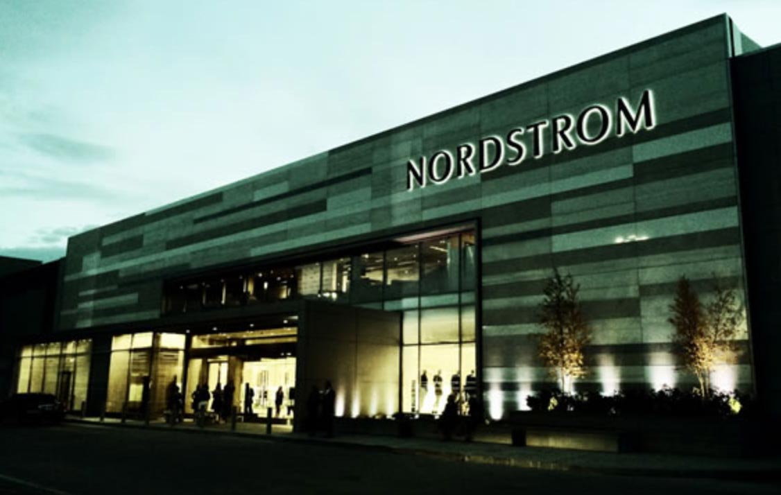
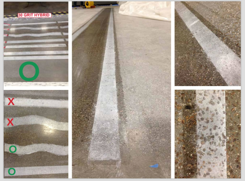
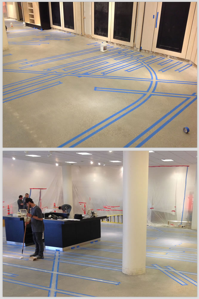
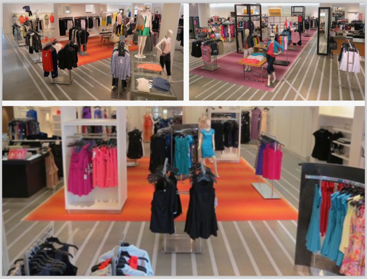
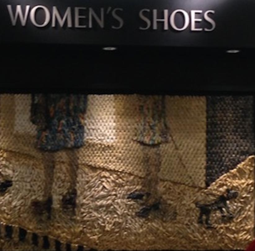
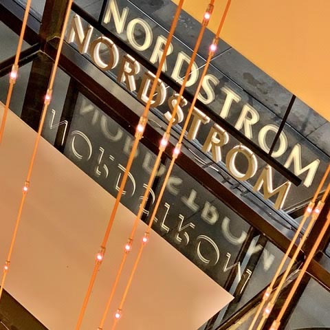
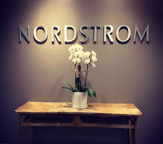
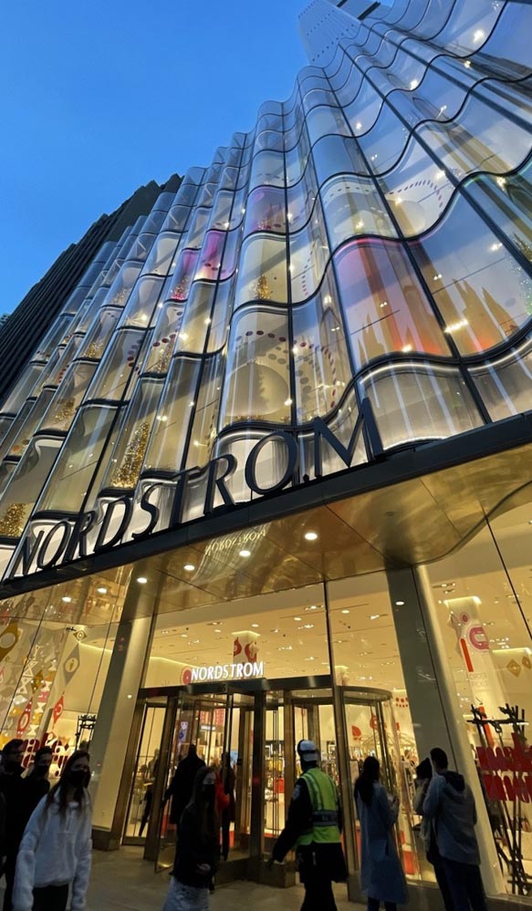
What if there was an intention to create a pattern language that could guide consumers, renovate places and simplify guest movement and sales engagement? Such was the case in our build-out of a patterning language in a succession of Nordstrom stores, starting with a study in brass screed patterning and metaphorical design thinking in a newly invented “woven warp and weft” screed array in the newly renovated floors of store one, Seattle flagship, downtown Nordstrom. That line of thinking was taken to Chicago and implemented in a dynamic renovation strategy for Nordstrom Irvine.
In that application, the carpeting and tiles were removed to the concrete substructure and the design played towards a pathway metaphor that was applied in a manner to accentuate guest journey. While this was an inexpensive renovation, its goal was to create a route-making expression that created pathways without creating guest blockades or guest / salespeople impediments. It was widely defined as strikingly successful. Customers were enchanted and store managers were delighted with the store still being operational during much of the renovation process.
The sequencing of this experiential design patterning maps into this cartography of approach:
NORDSTROM BRAND PATTERNING | IRVINE
![THE VISIBLE CODE OF THE BRAND | BRANDCODING® EXPERIENCE DESIGN]()
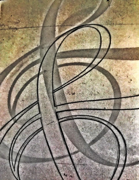
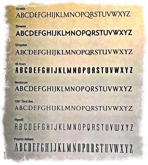
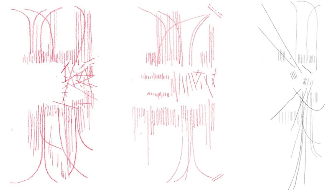
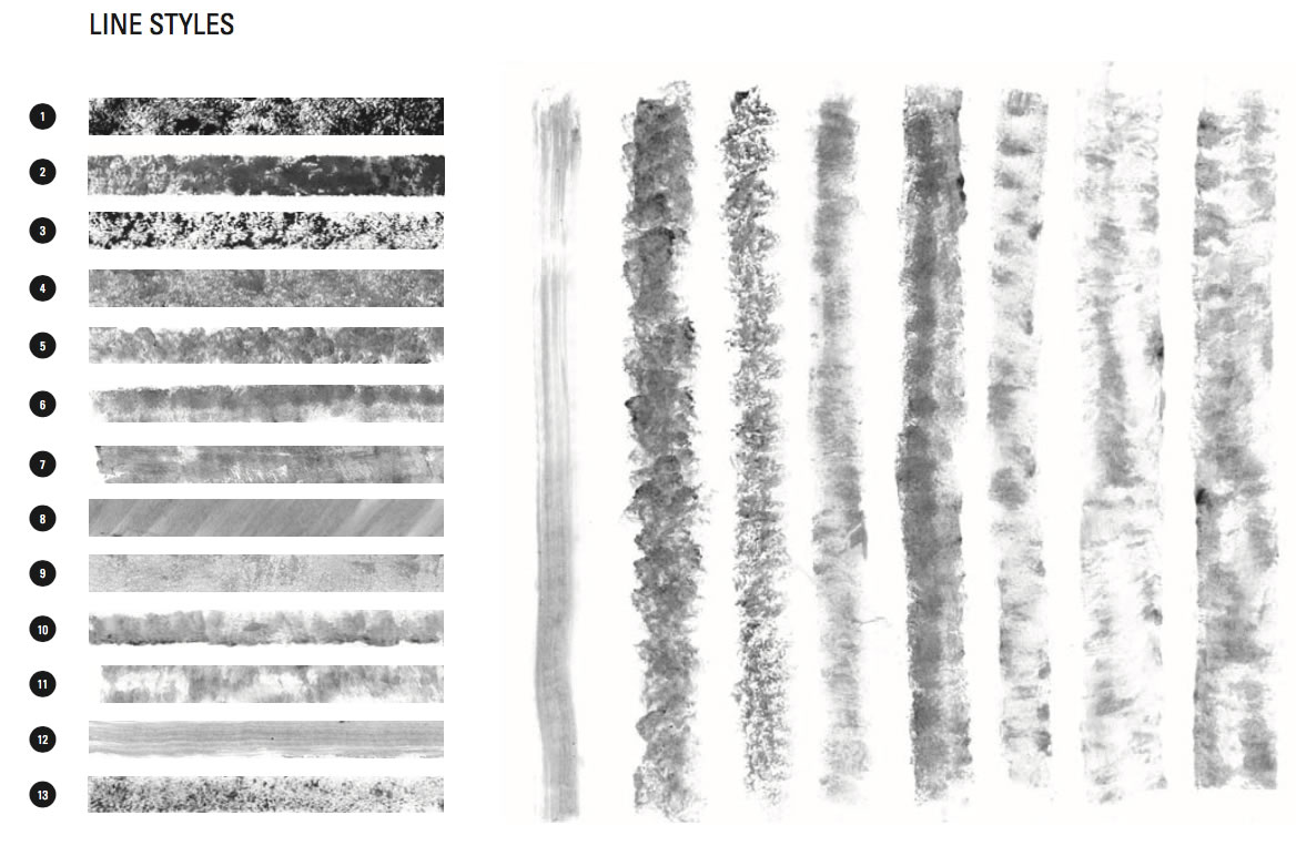
Referential allegory—the tailor’s chalkline
![THE VISIBLE CODE OF THE BRAND | BRANDCODING® EXPERIENCE DESIGN]()
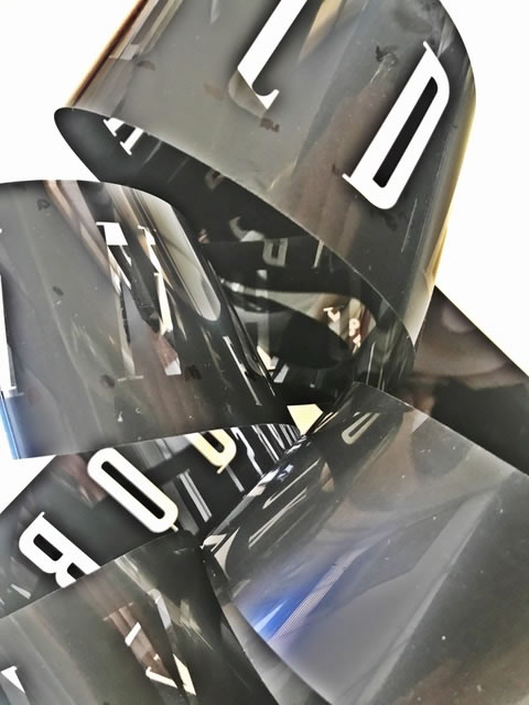
Possible pattern linguistics
![THE VISIBLE CODE OF THE BRAND | BRANDCODING® EXPERIENCE DESIGN]()
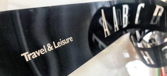
Trial floor arrays and conceptual sketches
![THE VISIBLE CODE OF THE BRAND | BRANDCODING® EXPERIENCE DESIGN]()
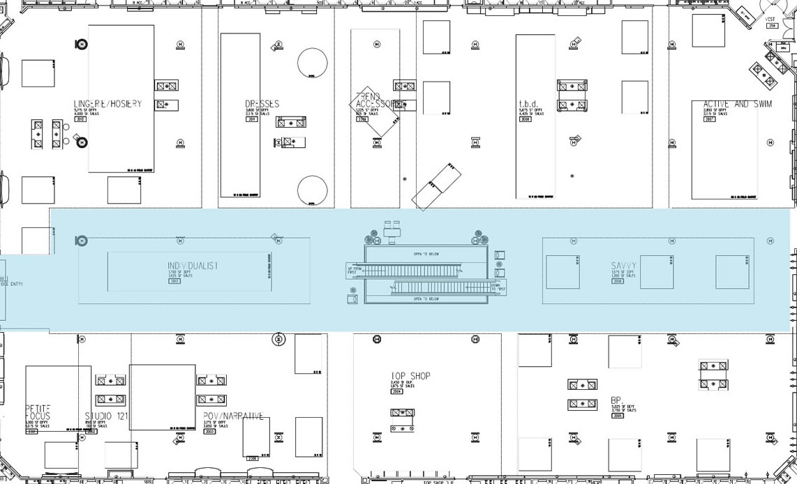
The floor plan
![THE VISIBLE CODE OF THE BRAND | BRANDCODING® EXPERIENCE DESIGN]()
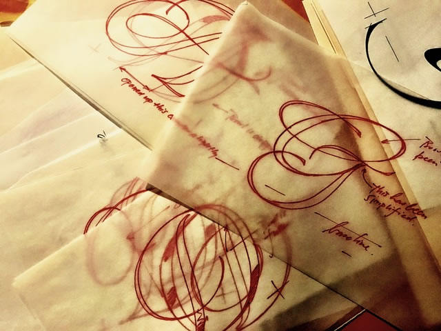
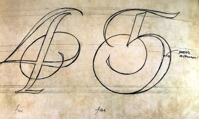
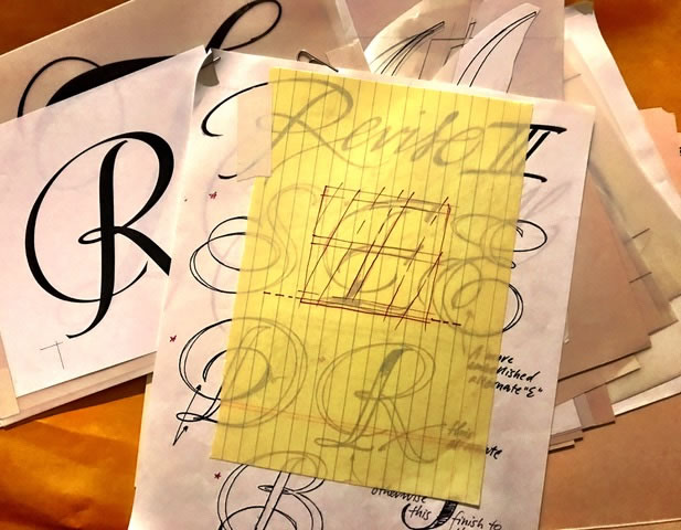
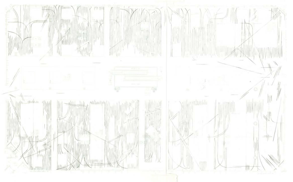
Pencilled sketches
![THE VISIBLE CODE OF THE BRAND | BRANDCODING® EXPERIENCE DESIGN]()
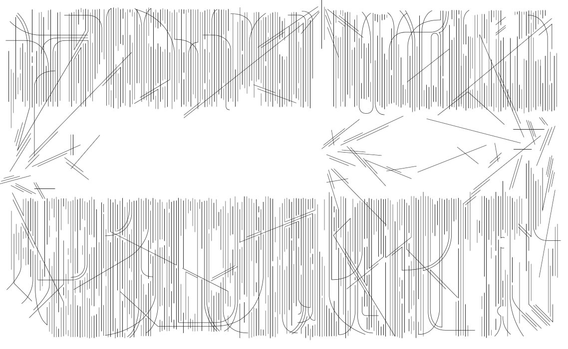
The precise digital redrafting
![THE VISIBLE CODE OF THE BRAND | BRANDCODING® EXPERIENCE DESIGN]()
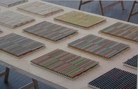
Explorations of texture and trial painting applications
![THE VISIBLE CODE OF THE BRAND | BRANDCODING® EXPERIENCE DESIGN]()
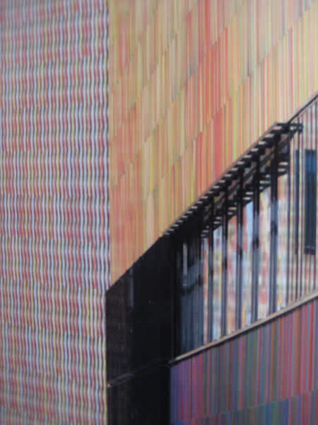
Concrete trials
![THE VISIBLE CODE OF THE BRAND | BRANDCODING® EXPERIENCE DESIGN]()
Masking of final array pathways
![THE VISIBLE CODE OF THE BRAND | BRANDCODING® EXPERIENCE DESIGN]()
Final floor treatments
![THE VISIBLE CODE OF THE BRAND | BRANDCODING® EXPERIENCE DESIGN]()
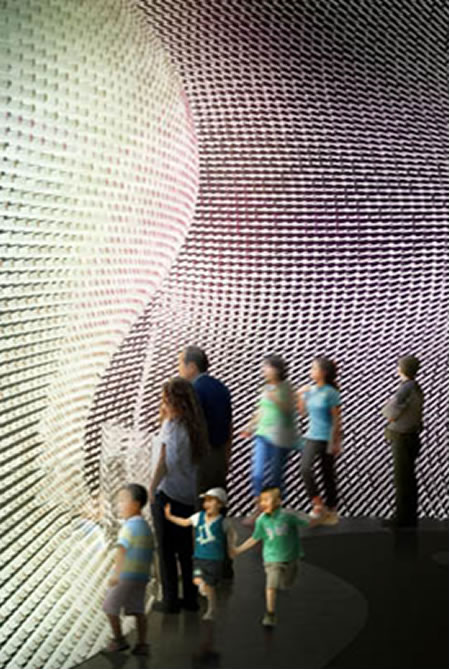
WHAT WE KNOW | EXPERIENCE DESIGN DETAILING: SENSATIONALISM AND MINUTIAE
Guests experience details. They notice the large sweeping gestures—but, in our experience in interviewing visitors—they recall the delicately displayed treatments. From our Disney interviews: “I remember how the carpets matched the journal’s icons, and how the signs explained how to get to the right place—it all fit together.”
Here, Irvine?
“This was like a guidance system that wasn’t—it showed a way. But it was playful and fun. It created a graphical energy that was uplifting. While we knew there was a renovation that happened, it kind of created a crisp vibration that broke down conventional barriers. It was freeing, since there was energy and rhythm in the lines—and they were like chalk-lines, which called to mind the spirit of bespoke tailoring. Which is a Nordstrom thing—perfect for me, perfect for you—well-made and just right.”
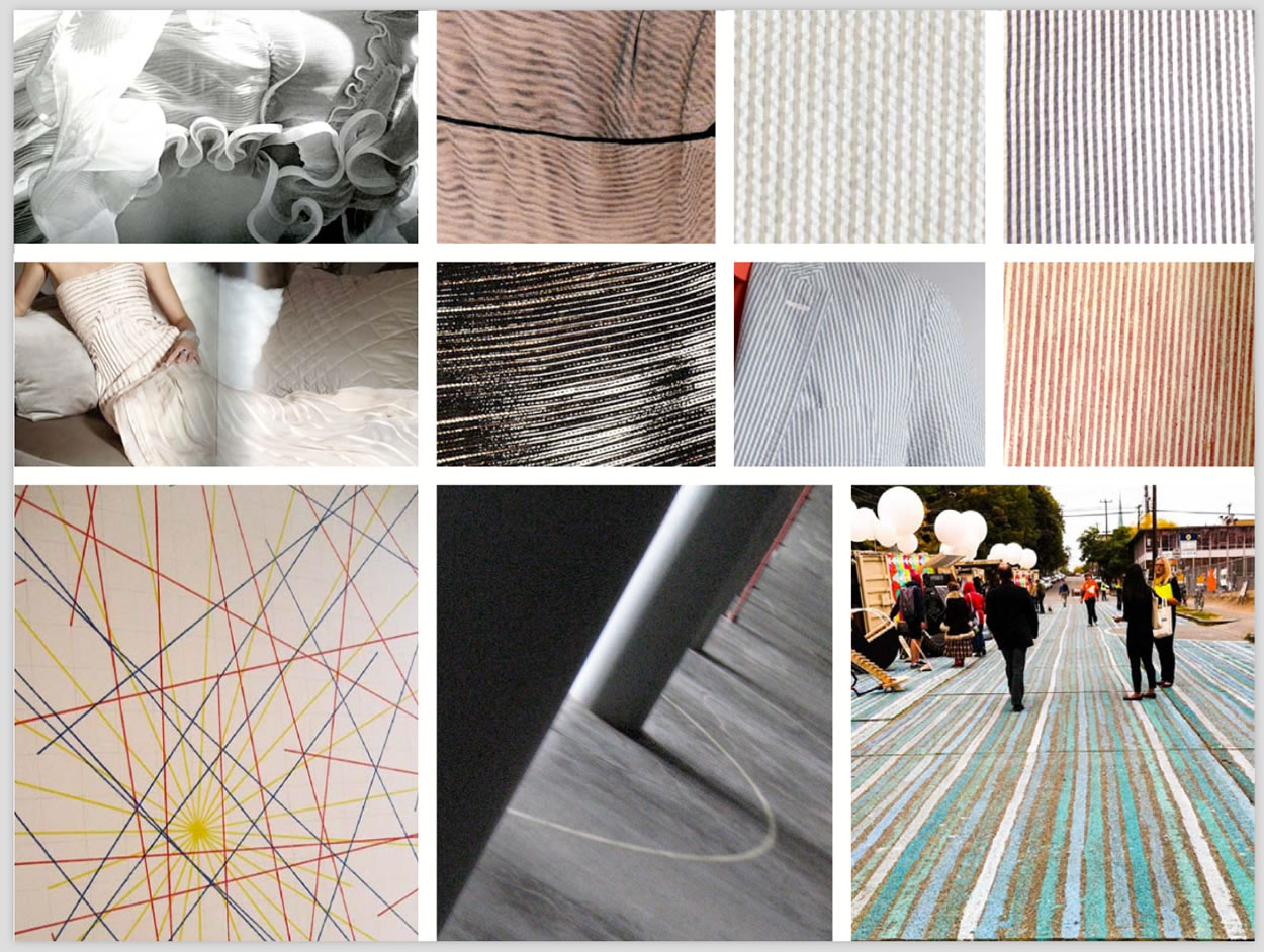
PATTERNING LANGUAGE AND INSPIRATION
I was walking the forest around my studio, looking at its pattern language — the light, the array of the trees, the patterning of light-lines on the forest floor, the tread of footprints in the shadowed light of sand dunes, grass patterning and the waved rippling of grained crystals.
It’s all a pattern, isn’t it?
And, as designers—and those shown and explored below—there are ways to look into
the heart of brand, soul-searching,
studying design vocabularies, messages and
deep metaphors to build out a patterning language.
Nature has her own story, which can be a founding guide to direction for thinking about brand patterning, allegory and deep brand space. Her patterns fill space, they flow out, occupy lightbound areas. She seeks the light and responds to it. In a manner, the examinations below do the same thing—they refract and pinhole the shadowing of light as a perforation or reflection of luminous movement.
![THE VISIBLE CODE OF THE BRAND | BRANDCODING® EXPERIENCE DESIGN]()
Would it be possible to consider the framing of patterns as
a layering to storytelling brand and experience design?
Surely.
There are patterns in storytelling—the rise and fall of characterizations, the landscape of narrative—the where, the how, the what—the riffing of the storyline—the plot journey, the character of suspense, emotionality, relevance and impact. And there are patterning expressions that can be found in the placement of stories in the context of actual environments—symbolic legacies, iconic references, myth and legendary implications, persona and attributes of the heart, soulfulness and magic, mystery and wonder.
It’s been an obsession with GIRVIN to explore the concepts of brand development and patterning in place-making. And it’s something, as well, that GIRVIN has been involved with for years. Ranging from simple shopfronts and graphic programs to design systems of substantially larger detail and scale. From quick restaurant skin/exterior design programs to Asian department stores of a significantly enlarged order.
But the key challenge in this exploration is the concept of how a brand manifests itself in meaningful place creation. Any brand, in the acknowledgment of an interior design scheme needs to consider how, and why, a participant in the place will recognize that sense of presence. Presence is the balance between intentional experience and experiencer attention — if the intention is fully realized, then a participant will fully recognize “where they are.”
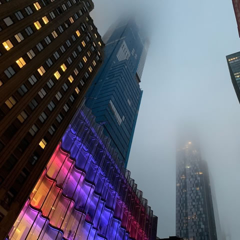
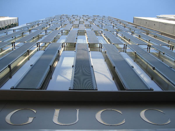
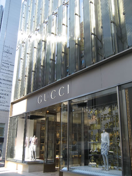
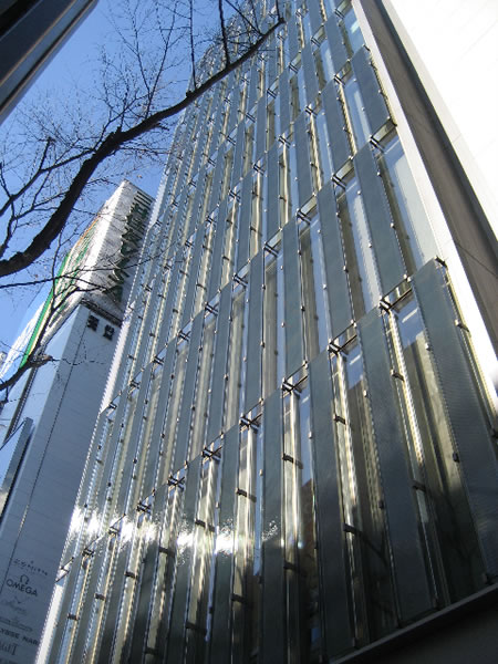
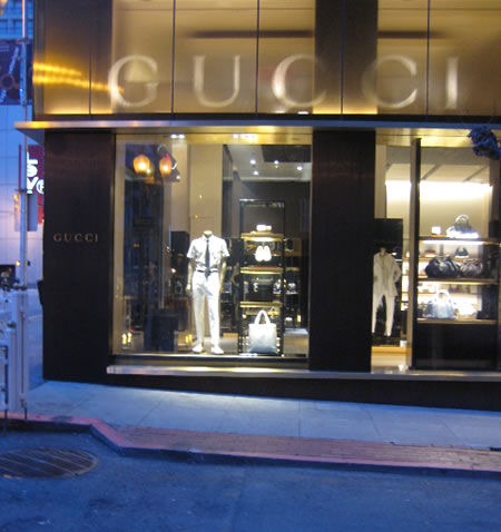
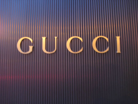
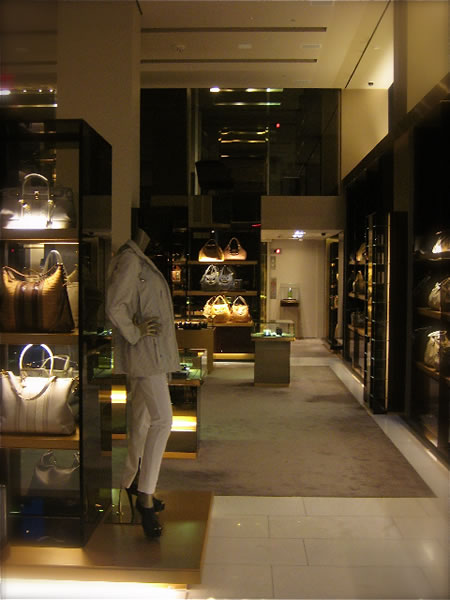
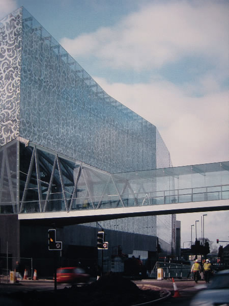
In walking the streets of San Francisco, working there recently, I was studying some examples of place-making and thematic brand implications in retail design. In the past, in two instances, in working with the team at Gucci | YSL, I’d linked to the design team that was promulgating the current design intentions of the evolution of the Gucci brand.
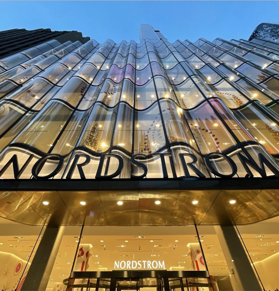
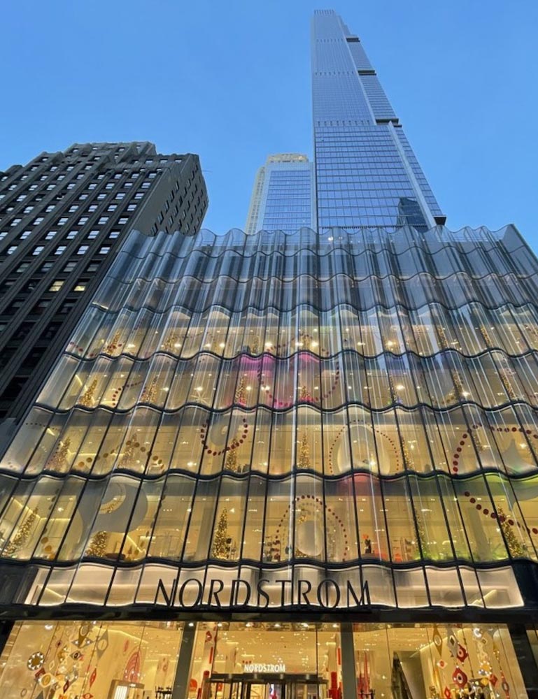
The overarching strategy was created by the design and creative director, Frida Gianni. and noted in a blog from 2008 at the launch of the new concept on 5th Avenue, NYC. The new store is just blocks south of another powerful retail presence, the opening strategy of Apple, also studied in an earlier photographic walk through. Interestingly enough, given the spectacularly powerful use of transparency in the design strategy of Apple’s first store in NYC, so too does Gucci consider the concept of transparency as part of their brand messaging. These components find themselves empowered in the vision of James Carpenter and his team — a group of architects, designers and engineers exploring glass, metal, fenestration and the visual story of light and refraction. Notes on his work here. It was Carpenter’s involvement, in particular, that lent, to Gucci, the concept of a uniquely formed glass cladding that evinced the character and rich lustre of the brand messaging and retail strategy. And Carpenter’s genius is in light. There’s a current story of course in the context of NordstromNYC.
And that story is about light.
![THE VISIBLE CODE OF THE BRAND | BRANDCODING® EXPERIENCE DESIGN]()
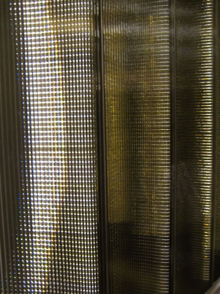
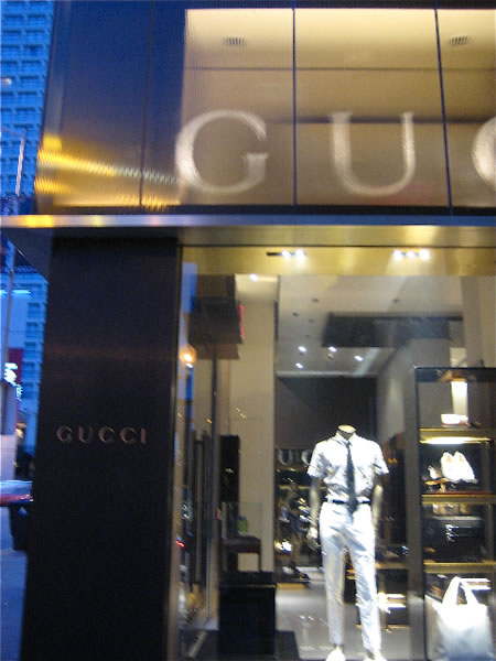
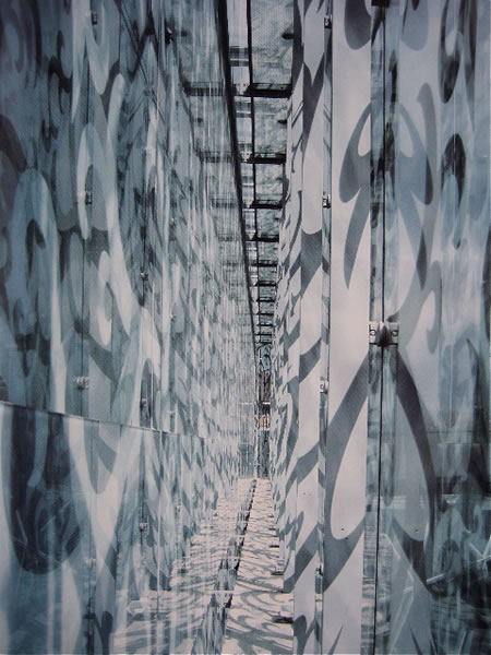
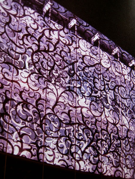
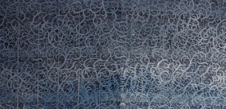
Back to Gucci—and Tokyo, you can see, in these photographs below by Dawn Clark, AIA LEED AP, some of the imagery of the system, as well as in the James Carpenter, specially-created glass that finds itself in an exterior expression.
![THE VISIBLE CODE OF THE BRAND | BRANDCODING® EXPERIENCE DESIGN]()
![THE VISIBLE CODE OF THE BRAND | BRANDCODING® EXPERIENCE DESIGN]()
![THE VISIBLE CODE OF THE BRAND | BRANDCODING® EXPERIENCE DESIGN]()
![THE VISIBLE CODE OF THE BRAND | BRANDCODING® EXPERIENCE DESIGN]()
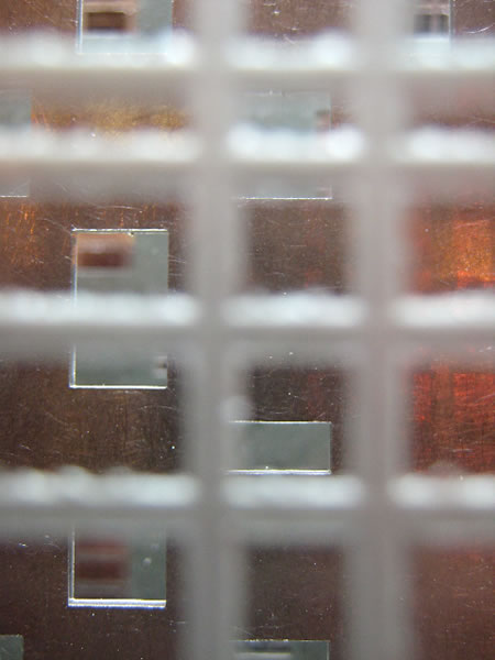
While it’s not perfectly evident in these images, the rainbowed luminosity of the treatment, the idea of the concept of light refractivity and reflective effects are part of the vocabulary of the brand—and even in alternate arrangements, other shop exteriors and interiors, this strategy is carried through.
In examining the idea of brand in relationship to comprehension, it might be said that the key principle is looking into the heart of the brand to the components that are actually meaningful. That is: with an experiencer, what’s the relation emotionally to the brand in terms of recognizable visual language?
![THE VISIBLE CODE OF THE BRAND | BRANDCODING® EXPERIENCE DESIGN]()
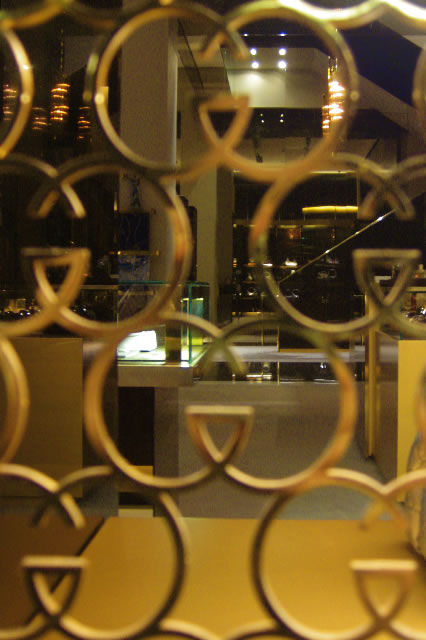
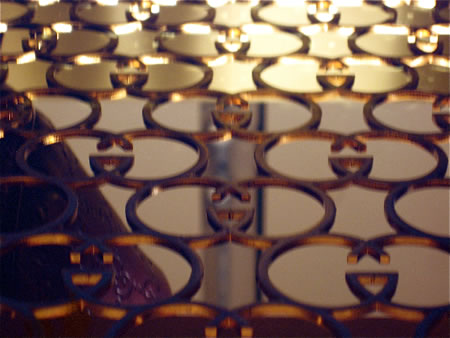
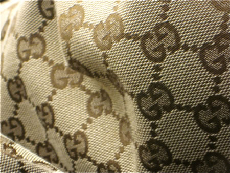
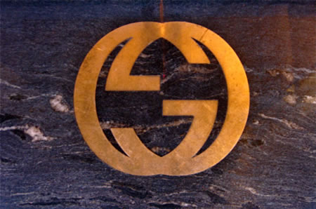
The G monogram is an iconic dispositoning element. A gesture to this would be the use of gold, the patterning of some of the product offerings—like woven fabric that is rhythmically expressing the brand—as well as signing and other details that might mimetically reference the brand conditions and attitude.
During a San Francisco client meeting, I wandered the neighborhood, these treatments evince Gucci’s branded essence—the conjoined G’s and the use of warm metals: gold being a more relevant materiality than, for example, silver or steel.
![THE VISIBLE CODE OF THE BRAND | BRANDCODING® EXPERIENCE DESIGN]()
![THE VISIBLE CODE OF THE BRAND | BRANDCODING® EXPERIENCE DESIGN]()
![THE VISIBLE CODE OF THE BRAND | BRANDCODING® EXPERIENCE DESIGN]()
![THE VISIBLE CODE OF THE BRAND | BRANDCODING® EXPERIENCE DESIGN]()
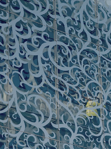
The brand patterning strategy—in the link to the opening flagship Tokyo retail launch of Gucci — and the explication of the work of James Carpenter’s team could be found in the use of ribbed glass-work cladding for the skin of the structure and the role this gesture to the interiors, as well. The rippled glass, the sense of layered transparency, the patterning of the brand—whether signed, incised or sheathed in the opacity of frosted skins—it’s all saying something.
![THE VISIBLE CODE OF THE BRAND | BRANDCODING® EXPERIENCE DESIGN]()
![THE VISIBLE CODE OF THE BRAND | BRANDCODING® EXPERIENCE DESIGN]()
![THE VISIBLE CODE OF THE BRAND | BRANDCODING® EXPERIENCE DESIGN]()
![THE VISIBLE CODE OF THE BRAND | BRANDCODING® EXPERIENCE DESIGN]()
![THE VISIBLE CODE OF THE BRAND | BRANDCODING® EXPERIENCE DESIGN]()
![THE VISIBLE CODE OF THE BRAND | BRANDCODING® EXPERIENCE DESIGN]()
Gucci brand: That sense of recallable distinction isn’t easily had. Walking to other stores in the neighborhood and exploring their sense of brand experience management lends lessened attention to the idea that every detail counts — especially in the presumptions of luxury experience design.
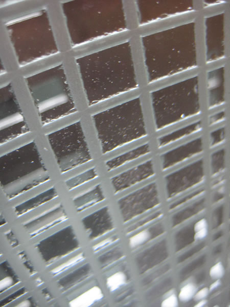
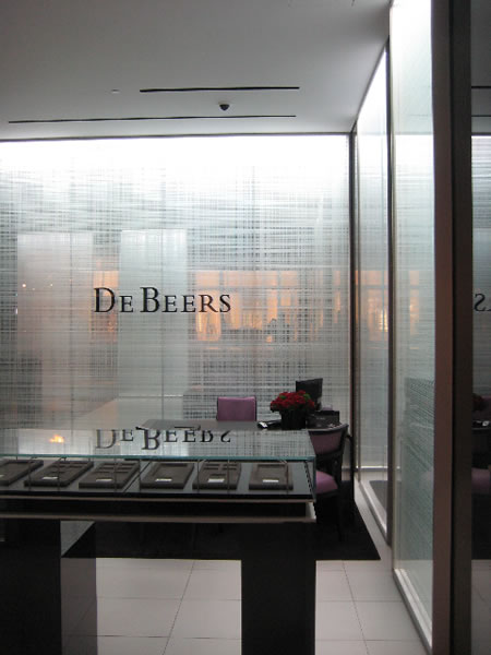
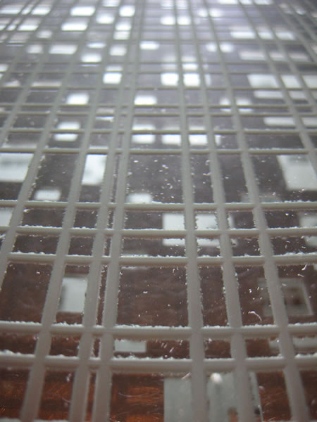
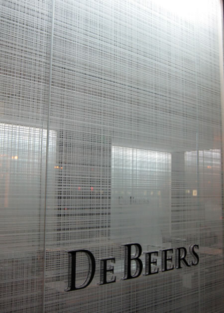
Another lesson in brand management of patterning and visible language might be found in the spirit of DeBeers new installation. Yet, while the character of the brand is widely known, it’s not clear what the mnemonic character of the patterning and how that might be recollected by a guest.
It’s one thing to be decorative, it’s another to be memorable in the particular indices of how consumers will relate to the brand. What’s the story and how is it visualized? Finding a code that will resonate is essential — and it’s never about the stylish graphics alone, but of the symbolism of the effort and how that would be perceived psychically in the meandering mind of the customer. It’s not that people aren’t looking, it’s that they might not know what they’re looking at. That doesn’t presuppose that people won’t get it — but for the embrace of a brand, the idea is there are familiarities that are subtly implicated to expand and deepen the richness of the experience.
What symbolism, then, might be suggested in these treatments?
![THE VISIBLE CODE OF THE BRAND | BRANDCODING® EXPERIENCE DESIGN]()
![THE VISIBLE CODE OF THE BRAND | BRANDCODING® EXPERIENCE DESIGN]()
![THE VISIBLE CODE OF THE BRAND | BRANDCODING® EXPERIENCE DESIGN]()
![THE VISIBLE CODE OF THE BRAND | BRANDCODING® EXPERIENCE DESIGN]()
![THE VISIBLE CODE OF THE BRAND | BRANDCODING® EXPERIENCE DESIGN]()
![THE VISIBLE CODE OF THE BRAND | BRANDCODING® EXPERIENCE DESIGN]()
Sandblasting cross-layered rules as a gesture to diamond cutting?
![THE VISIBLE CODE OF THE BRAND | BRANDCODING® EXPERIENCE DESIGN]()
MERCHANDISING BRANDCODE®
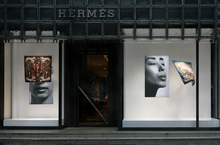
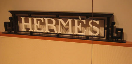
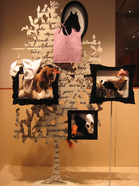
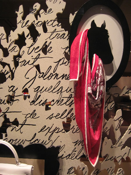
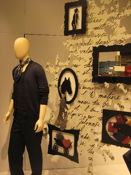
I believe, as well, that coding the brand — in retail presence — can take components from merchandising and bring them back to brand. The implications of the legacy of Hermés as a saddlery and equestrian outfitter lend themselves to the notion of taking the “tack” of merchandising framing — in this instance, literally: framing.
![THE VISIBLE CODE OF THE BRAND | BRANDCODING® EXPERIENCE DESIGN]()
Framing that comes from the styling of equine equipage, as well as their stylistic expressions. I shot these in San Francisco, just down the block from Gucci and DeBeers.
The horse legacy:
![THE VISIBLE CODE OF THE BRAND | BRANDCODING® EXPERIENCE DESIGN]()
![THE VISIBLE CODE OF THE BRAND | BRANDCODING® EXPERIENCE DESIGN]()
![THE VISIBLE CODE OF THE BRAND | BRANDCODING® EXPERIENCE DESIGN]()
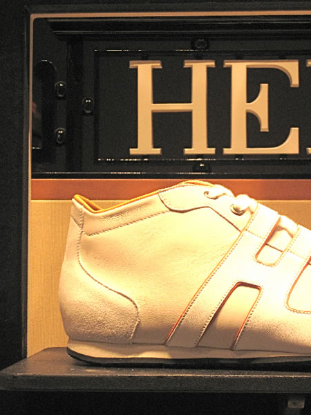
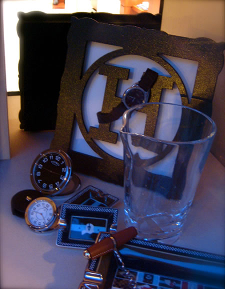
Framing signage:
![THE VISIBLE CODE OF THE BRAND | BRANDCODING® EXPERIENCE DESIGN]()
![THE VISIBLE CODE OF THE BRAND | BRANDCODING® EXPERIENCE DESIGN]()
![THE VISIBLE CODE OF THE BRAND | BRANDCODING® EXPERIENCE DESIGN]()
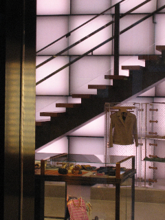
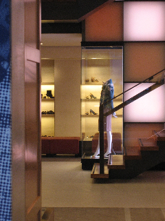
PATTERN OR DECORATION:
There’s another conceptual string, to the notion of this exploration — the use of patterning as a detail that supports the creation of place, but the adaptive character of that expression as a link to the larger conceptual thread of experience design. Architects are not wont to call their work — experience design — but in the layering of this review — we’ll call it that. Personally, working less in the corporate marketplace and more in the realm of retail, entertainment and restaurants, I’ll link the concept of brand to story, and most of the buildings noted below have a sense of story attached to them. Narrative in architecture might relate to the idea of procession — the movement into the place, and the experience therein. That sense of spatial exploration and movement in place can be light, openness, compression, channeling, scent, vista, touch — both intimately scaled and dynamically expansive. The containment of architecture can be delicate or gigantic — and each has its own sense of power. What I find compelling is the bridge between these worlds — the entertainment of light, space and place — in how a human can experience a built world.
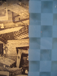
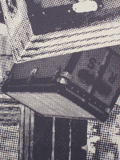
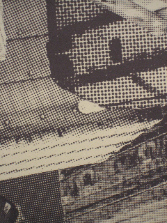
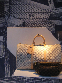
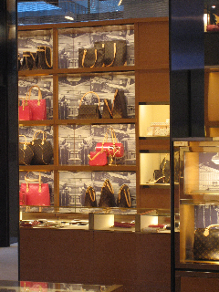
Louis Vuitton Brand Patterning:
Luggage patterning becomes merchandising substrates.
This double image references wall glass checkerboard with a collage wall paper—a code from the luggage.
![THE VISIBLE CODE OF THE BRAND | BRANDCODING® EXPERIENCE DESIGN]()
Merchandising of product and patterning — one language becomes another.
![THE VISIBLE CODE OF THE BRAND | BRANDCODING® EXPERIENCE DESIGN]()
![THE VISIBLE CODE OF THE BRAND | BRANDCODING® EXPERIENCE DESIGN]()
![THE VISIBLE CODE OF THE BRAND | BRANDCODING® EXPERIENCE DESIGN]()
![THE VISIBLE CODE OF THE BRAND | BRANDCODING® EXPERIENCE DESIGN]()
![THE VISIBLE CODE OF THE BRAND | BRANDCODING® EXPERIENCE DESIGN]()
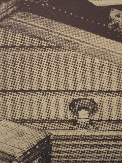
The geometry of wall treatments becomes a diffusion of the brand language—the code of the square, the checkerboard, the luggage treatments.
![THE VISIBLE CODE OF THE BRAND | BRANDCODING® EXPERIENCE DESIGN]()
![THE VISIBLE CODE OF THE BRAND | BRANDCODING® EXPERIENCE DESIGN]()
Merchandising design rhythms—brandcode becomes patterning visual display.
Shinkenchiku.net is the entity behind A+U | Architecture + Urbanism, one of the best periodicals on the planet for exploring trends in the best of the best of architectural strategy and exposition. Amazing—and sometimes unseen—structures abound in this collection, that dates back in a series to the coverage of the late 80s to the present time.
There are some renderings of relevance exploring the use of materials and patterning in treatments, for architecture, and below I’ve gathered some of these. Really, to deeply understand the work, I’ve tried to offer site links—a comprehensive online version for A+U doesn’t seem to exist..
The PET wall | Blaine Brownell
![THE VISIBLE CODE OF THE BRAND | BRANDCODING® EXPERIENCE DESIGN]()
An issue features a story and an image of a project by Seattle architect Blaine Brownell. Brownell has focused on what he calls disruptive materials. A+U describes his efforts in the magazine in the following way, his blog notes, “Ceramic, glass, concrete and metals are ordinary materials architects are familiar with. Through new treatments and interpretation, these ordinary materials can be transformed by technology resulting in new architectural effects. When glass is printed, sight lines are altered, creating various degrees of transparency. In the form of a fabric, metal acquires malleability instead of rigidity. By engraving patterns onto concrete, the smooth surface takes on a new texture. The projects in this issue are marked by this characteristic that could lead us into new expectations for the future of building and construction. In his essay, Blaine Brownell introduces a host of new materials that are developed due to environmental concerns, a surge in technological advancements and the rise of developing cities. As we enter a new decade, inevitable change to architecture, construction and resources await us. As Brownell advocates, ‘it is precisely the intersection of environmental, technological, and design innovation that holds the most promising future for architecture.“
His opening essay, which accompanies the foreword is an articulate expansion on his thinking — from one view, a technological overview of remarkable new materials, and on the other, the ideas that these materials might create better environments, more interesting places for humans to live and be in. There are a series of publications that add to the mix, Brownell’s Transmaterial series—great books to explore what’s new in the applications of materials to architectural and interior space. On the site, as well, you can link to an ongoing email that outlines Brownell’s explorations. Amazing are the submissions he receives, researches and offers to his readership.
Explore as you will.
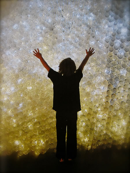
Blaine offers a representative treatment of this thinking in the use of new materials, an installation of PET bottles, transilluminated from the inside, creating a luminescent, even organic space. That, to speak to the character of this review, relates to that idea of patterning—unique materials, arrayed—in presenting place in a new way.
![THE VISIBLE CODE OF THE BRAND | BRANDCODING® EXPERIENCE DESIGN]()
Design and Photography by Blaine Brownell
M A T E R I A L I T Y:
BRAND LANGUAGE AND CODING AS PATTERNING METAPHORS
Some other references, to materials and patterning:
![THE VISIBLE CODE OF THE BRAND | BRANDCODING® EXPERIENCE DESIGN]()
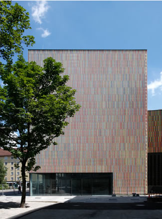
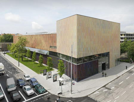
Sauerbruch Hutton | Museum Brandhorst
Munich, Germany | Ceramic Cladding
![THE VISIBLE CODE OF THE BRAND | BRANDCODING® EXPERIENCE DESIGN]()
![THE VISIBLE CODE OF THE BRAND | BRANDCODING® EXPERIENCE DESIGN]()
![THE VISIBLE CODE OF THE BRAND | BRANDCODING® EXPERIENCE DESIGN]()
![THE VISIBLE CODE OF THE BRAND | BRANDCODING® EXPERIENCE DESIGN]()
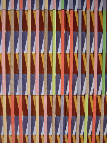
The intriguing component of this work is reflecting the vitality of a museum “brand,” in the context of vital color applications, complexity belying the beauty and clean clarity of the spaces within.
Notes from Brandhorst: The Multi-Coloured Façade
The façade looks like an abstract painting and draws attention to the building’s function as an art museum. It comprises various layers with different functions. On top of the building’s substructure and insulation there is a layer of horizontally folded sheet metal with fine perforations. In front of this, 36,000 ceramic rods have been fixed vertically. These are finished in 23 different coloured glazes and fall into three groups of shades and tonality, accentuating the impression optically that the building is made up of three separate, interlocked volumes. Walking past the building, the surface of the façade seems to alter. There are countless variations in the appearance of the materials and the structure: seen from an angle the vertical ceramic rods form one smooth surface; seen face on, the horizontally emphasized background is visible and becomes the dominant feature. From a distance, the groups of different colours blend into neutral shades, each with a different brilliance and tonal impact. From close to, each of these fields becomes broken down into its component colours.
![THE VISIBLE CODE OF THE BRAND | BRANDCODING® EXPERIENCE DESIGN]()
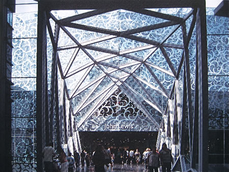
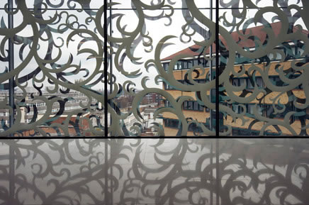
Foreign Office Architects | John Lewis Department Store and Cineplex | Leicester, UK
![THE VISIBLE CODE OF THE BRAND | BRANDCODING® EXPERIENCE DESIGN]()
![THE VISIBLE CODE OF THE BRAND | BRANDCODING® EXPERIENCE DESIGN]()
![THE VISIBLE CODE OF THE BRAND | BRANDCODING® EXPERIENCE DESIGN]()
![THE VISIBLE CODE OF THE BRAND | BRANDCODING® EXPERIENCE DESIGN]()
![THE VISIBLE CODE OF THE BRAND | BRANDCODING® EXPERIENCE DESIGN]()
![THE VISIBLE CODE OF THE BRAND | BRANDCODING® EXPERIENCE DESIGN]()
AECWORLDXP: “The most outstanding feature of the store design is the façade, which is designed as a net curtain ensuring a light, transparent touch to the bulk of the building volume. The concept is born out of two factors: the desire to provide privacy to the interior while still allowing it to receive natural light, and to devise the pattern for the net curtain in a way that appropriately reflects the cultural and historical traditions of Leicester as a city. A steel and glass bridge connects the Department Store to the multi-storey parking block across Vaughan Way, while another bridge at the rear connects it to the existing Shires Mall. The building occupies a whole block with a main street frontage at one end and an existing shopping centre at the other. The net curtain pattern was applied over the entire street-facing façade, which makes it appear less opaque from the outside, and at the same time renders the store layout flexible enough to be rearranged as and when required.
The store cladding was designed as a double-glazed façade, creating a controlled level of transparency between the store interiors and the city. The pattern of the net curtain drew inspiration from Leicester’s 200 years history of textiles and weaving, the translucent saris worn by the a sizable Indian population that lives there and John Lewis’s tradition of producing quality fabrics. The pattern, chosen from John Lewis’ archive of textile patterns, was developed to produce a number of templates that allowed for a variable degree of transparency across the department store perimeter and produced a seamless textile-like cladding. To further integrate the context in the design, the pattern was applied in mirror ceramic frit on the external layer, which reflected the context onto itself. For the design of the cinema frontage, there was an attempt to continue with the notion of the ‘curtain’, but one that is opaque, similar to traditional curtains used in cinema interiors.“
![THE VISIBLE CODE OF THE BRAND | BRANDCODING® EXPERIENCE DESIGN]()
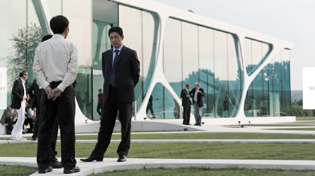
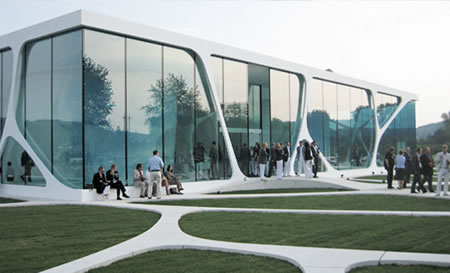
3DELUXE | Leonardo Glass Cube | Bad Driburg, Germany
Creating a “brand world” for the company Leonardo, the transdisciplinary firm 3Deluxe defines their design strategy for this German glass technology group. Here, the patterning language is truly brand-linked, forming the basis for a much larger integrated expression of the Glaskoch premise.
![THE VISIBLE CODE OF THE BRAND | BRANDCODING® EXPERIENCE DESIGN]()
![THE VISIBLE CODE OF THE BRAND | BRANDCODING® EXPERIENCE DESIGN]()
![THE VISIBLE CODE OF THE BRAND | BRANDCODING® EXPERIENCE DESIGN]()
![THE VISIBLE CODE OF THE BRAND | BRANDCODING® EXPERIENCE DESIGN]()
![THE VISIBLE CODE OF THE BRAND | BRANDCODING® EXPERIENCE DESIGN]()
![THE VISIBLE CODE OF THE BRAND | BRANDCODING® EXPERIENCE DESIGN]()
![THE VISIBLE CODE OF THE BRAND | BRANDCODING® EXPERIENCE DESIGN]()
Blog imagery from le deluxe and www.glass-cube.de.
Glass Cube inspirations from Leonardo: “With the opening of the LEONARDO glass cube in Bad Driburg in May 2007 the vision of developing the glass brand into a Lifestyle Company received an architectural face. In a unique and innovative architecture the multifunctional building unites a Brandworld, an Academy Area as well as a Design Lab. The liaison of soft, organic structures and a clear, linear glass cover convey ingeniously the three core brand values – Inspiration, Emotion and Quality.“
![THE VISIBLE CODE OF THE BRAND | BRANDCODING® EXPERIENCE DESIGN]()
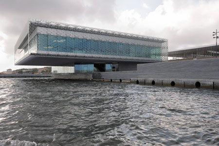
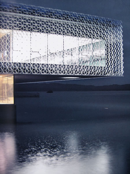
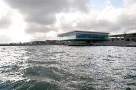
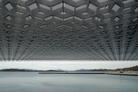
Stefano Boeri Architetti | Ex Arsenal at La Maddalena | Sardinia, Italy
![THE VISIBLE CODE OF THE BRAND | BRANDCODING® EXPERIENCE DESIGN]()
![THE VISIBLE CODE OF THE BRAND | BRANDCODING® EXPERIENCE DESIGN]()
![THE VISIBLE CODE OF THE BRAND | BRANDCODING® EXPERIENCE DESIGN]()
![THE VISIBLE CODE OF THE BRAND | BRANDCODING® EXPERIENCE DESIGN]()
![THE VISIBLE CODE OF THE BRAND | BRANDCODING® EXPERIENCE DESIGN]()
From Stefano Boeri’s site: “THE CONFERENCE HALL: a glass cube suspended over the water The Conference Hall, plausibly the most representative of the interventions, is a glass and basalt prism that cantilevers over the water. Almost 2000m2, it is a new construction that hosts – aside from flexible spaces for nautical events – a large conference hall suspended 6 meters above water that looks out towards the extraordinary panorama of the Gallura. A new landmark for the Maddalena Archipelago that reinterprets in visionary key the relation between the power of the surrounding natural elements and the rigorous forms of traditional Italian military architecture.“
The concepts of patterning, to the designer’s interpretation, come from the discipline of Italian martial architecture, so in a manner, this idea of brand and patterning in place making relates to the spirit of this premise.
![THE VISIBLE CODE OF THE BRAND | BRANDCODING® EXPERIENCE DESIGN]()
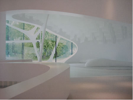
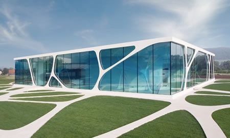
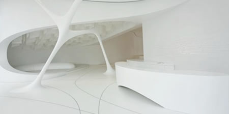
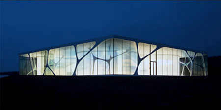
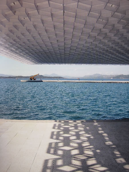
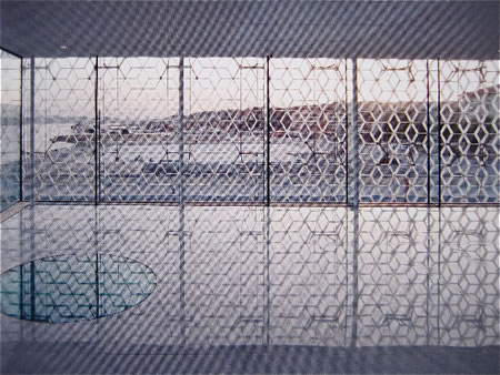
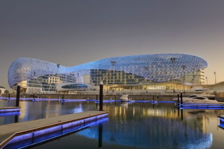
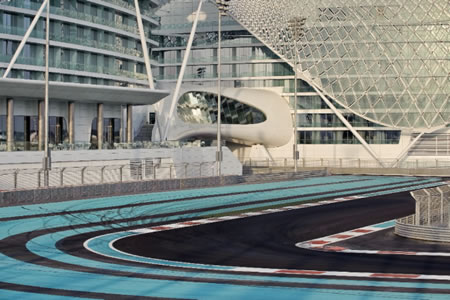
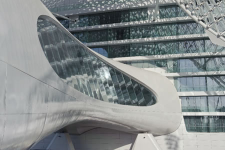
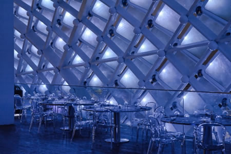
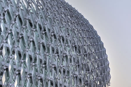
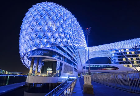
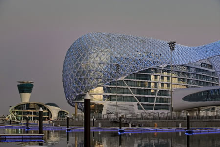
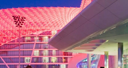
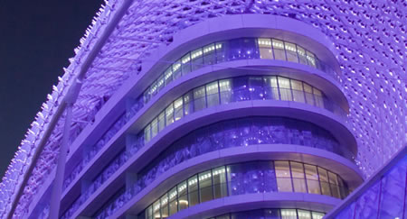
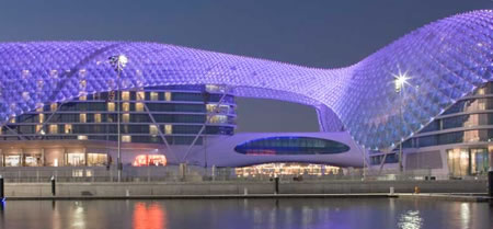
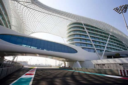
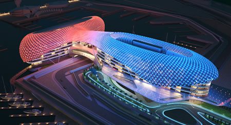
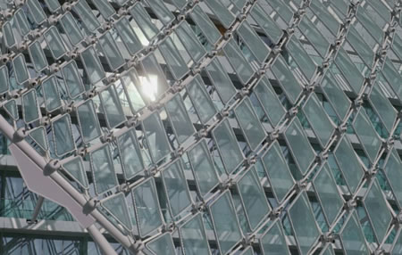
Asymptote | The Yas Hotel | Abu Dhabi, UAE
![THE VISIBLE CODE OF THE BRAND | BRANDCODING® EXPERIENCE DESIGN]()
![THE VISIBLE CODE OF THE BRAND | BRANDCODING® EXPERIENCE DESIGN]()
![THE VISIBLE CODE OF THE BRAND | BRANDCODING® EXPERIENCE DESIGN]()
![THE VISIBLE CODE OF THE BRAND | BRANDCODING® EXPERIENCE DESIGN]()
![THE VISIBLE CODE OF THE BRAND | BRANDCODING® EXPERIENCE DESIGN]()
![THE VISIBLE CODE OF THE BRAND | BRANDCODING® EXPERIENCE DESIGN]()
![THE VISIBLE CODE OF THE BRAND | BRANDCODING® EXPERIENCE DESIGN]()
![THE VISIBLE CODE OF THE BRAND | BRANDCODING® EXPERIENCE DESIGN]()
![THE VISIBLE CODE OF THE BRAND | BRANDCODING® EXPERIENCE DESIGN]()
![THE VISIBLE CODE OF THE BRAND | BRANDCODING® EXPERIENCE DESIGN]()
![THE VISIBLE CODE OF THE BRAND | BRANDCODING® EXPERIENCE DESIGN]()
All imagery © Asymptote: Hani Rashi + Lise Anne Couture, Courtesy of Bjorn Moerman
![THE VISIBLE CODE OF THE BRAND | BRANDCODING® EXPERIENCE DESIGN]()
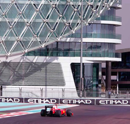
Arup, the engineering group defines the patterning in the following manner:
![THE VISIBLE CODE OF THE BRAND | BRANDCODING® EXPERIENCE DESIGN]()
“Façade design | The skin of the grid-shell comprises approximately 5,000 diamond-shaped glass panels, varying in size. These panels enable the complex geometry of the façade to be a medium for sequenced lighting or moving imagery. In this way the building adds both to the racetrack atmosphere and the hotel’s brand image.
The glass panels have a carefully-selected coating and frit pattern that balances visual transparency with light-responsive properties according to different local conditions. They are each individually lit with a bespoke RGBW LED luminaire designed to give asymmetrical light distribution.
For the bridges Arup utilised high-efficiency fluorescent and LED technology integrated into the structure and architectural components, along with adjustable ceramic metal halide sources, with glare protection for drivers and spectators alike.“
Again, the link to patterning in brand presence and place making context forms a holistic impression — in this instance — of enormous scale and challenge.
![THE VISIBLE CODE OF THE BRAND | BRANDCODING® EXPERIENCE DESIGN]()
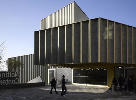
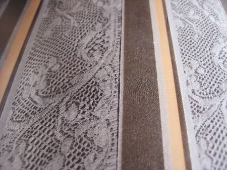
Caruso St John Architects | Nottingham Contemporary | Nottinghamshire, UK
![THE VISIBLE CODE OF THE BRAND | BRANDCODING® EXPERIENCE DESIGN]()
![THE VISIBLE CODE OF THE BRAND | BRANDCODING® EXPERIENCE DESIGN]()
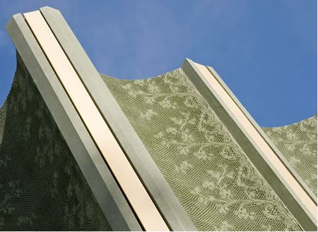
According to the site, “Nottingham Contemporary was designed by the award winning architects Caruso St John. They were inspired by the surrounding Lace Market, specifically the bold, elegant design of the warehouses that serviced the city’s world famous trade in the 19th century. Former warehouses in other cities have proved flexible and creative spaces for artists’ activities, as in 60s New York or 90s Berlin. Its unusual form is the outcome of building right to the edge of the irregular site (as a consequence, there is just one perfectly rectangular room in the building). Our building has been constructed from scratch on what is said to be the oldest site in the city, home to a Saxon fort, a medieval Town Hall, and finally a late Victorian railway cutting. The steps at the side of the building have recreated a historic right of way.
At 3,000 square metres, Nottingham Contemporary is one of the largest contemporary art centres in the UK. It has four galleries – lit by 132 skylights – a performance and film Space, a Learning room, The Study, The Shop and Café.Bar.Contemporary.“
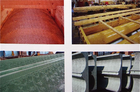
The notion of the patterning — laid into sequences of rollers for casting and impression, created lace treatments for casted applications in concrete, as shown, in detail, below.
![THE VISIBLE CODE OF THE BRAND | BRANDCODING® EXPERIENCE DESIGN]()
![THE VISIBLE CODE OF THE BRAND | BRANDCODING® EXPERIENCE DESIGN]()
![THE VISIBLE CODE OF THE BRAND | BRANDCODING® EXPERIENCE DESIGN]()
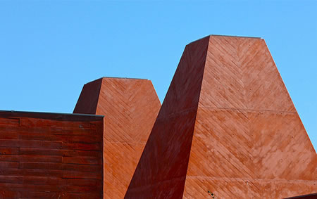
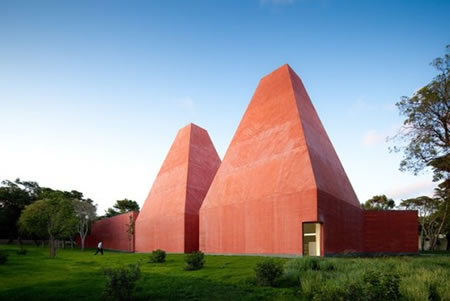
Eduardo Souto de Moura | Museu Paula Rêgo | Casais, Portugal
To the notion of examining the concept of patterning, capturing the storytelling of the human, living brand of Paula Rêgo — applied here — the character of the plank lain on concrete, that forms the rhythm.
![THE VISIBLE CODE OF THE BRAND | BRANDCODING® EXPERIENCE DESIGN]()
![THE VISIBLE CODE OF THE BRAND | BRANDCODING® EXPERIENCE DESIGN]()
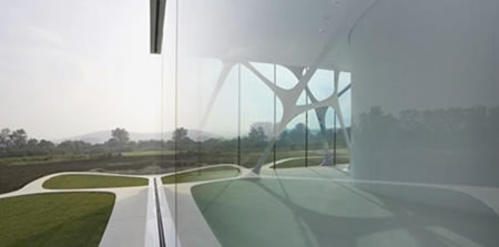
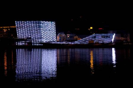
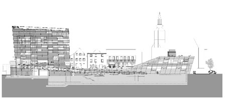
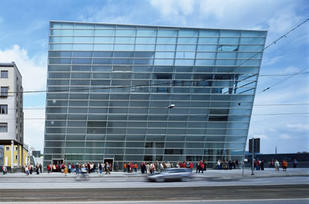
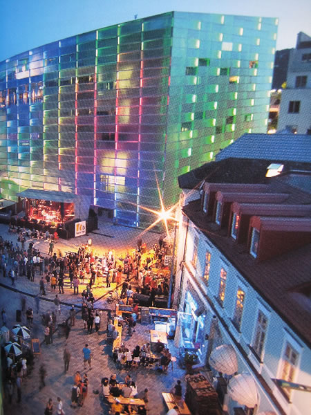
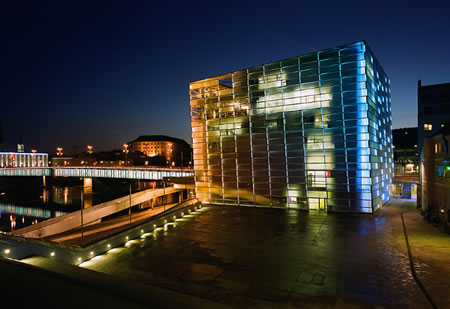
Treusch Architecture | Extension of the Ars Electronica Center | Linz, Austria
![THE VISIBLE CODE OF THE BRAND | BRANDCODING® EXPERIENCE DESIGN]()
![THE VISIBLE CODE OF THE BRAND | BRANDCODING® EXPERIENCE DESIGN]()
![THE VISIBLE CODE OF THE BRAND | BRANDCODING® EXPERIENCE DESIGN]()
![THE VISIBLE CODE OF THE BRAND | BRANDCODING® EXPERIENCE DESIGN]()
![THE VISIBLE CODE OF THE BRAND | BRANDCODING® EXPERIENCE DESIGN]()
![THE VISIBLE CODE OF THE BRAND | BRANDCODING® EXPERIENCE DESIGN]()
To the notes of the site on the commentary, translated from the German, the architects offer: “The main thought behind the design has been to create a sculptured building with a structure totally accessible by foot, and therefore an exciting experience within itself. The existing Ars Electronica Center and the new extension are connected to form one unit to be perceived as an ensemble. The crystal-like appearance generates a homogeneous interaction with its surroundings, at the same time becoming a distinctive landmark.“
![THE VISIBLE CODE OF THE BRAND | BRANDCODING® EXPERIENCE DESIGN]()
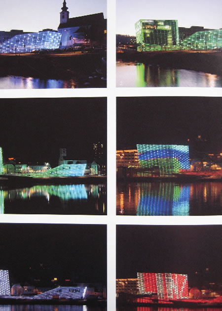
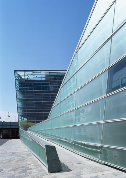
“Facade Design
The existing Ars Electronica Center is connected to the new main and supply building by a steel & glass construction. The double glass facade, partly transparent and partly translucent, can be illuminated by LED (liquid emitting diode) technology installed in the space between the two layers of the facade. Each facade element with its own LED panel can be individually controlled, with colour and brightness/intensity (RGBW) infinitely variable. This innovative lighting system – unique in Europe – presents artists with a whole new range of imaginative creativity. The Ars Electronica Center also presents another speciality as standard illumination, the facility to display pure white light. The AEC building turns into a glowing white crystal at the touch of a button.“
To the conceptions of patterning, light moves as a lightning path of array of ideas and creativity — the glass façade shows the nature of the illuminated paneling as a builder of the language of electronic magic.
![THE VISIBLE CODE OF THE BRAND | BRANDCODING® EXPERIENCE DESIGN]()
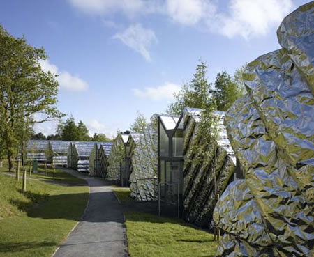
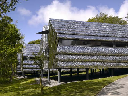
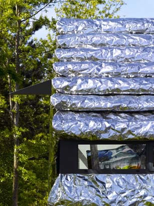
Heatherwick Studio | Aberystwyth Business Units | Aberystwyth, UK
![THE VISIBLE CODE OF THE BRAND | BRANDCODING® EXPERIENCE DESIGN]()
![THE VISIBLE CODE OF THE BRAND | BRANDCODING® EXPERIENCE DESIGN]()
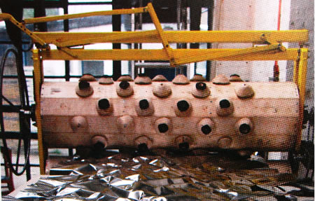
From the site: “The studio developed a special cladding system for the buildings. As stainless steel is everlasting but expensive, the studio sourced steel the thickness of cooking foil. This makes it affordable, but it crinkles easily, providing neither structural rigidity nor insulation. These problems are overcome by crinkling it in a controlled manner before spraying a CFC-free insulation foam on the back of the crinkled surface. The paneling is affordable, rigid and well insulated; it accommodates details like eaves and windowsills and has a non- uniformity, reflecting the forest’s leaves and pieces of sky in its facets.“
![THE VISIBLE CODE OF THE BRAND | BRANDCODING® EXPERIENCE DESIGN]()
The patterning to this system, an amazing expansion on the innovations of Heatherwick’s inventive mind — in this instance, a crumpled yet highly durable solution, cost conscious, but offering a distinctive link to the character of a start up colony of “business pods” at Aberystwyth. I might offer, as well, that Heatherwick’s newest solution for the UK pavilion in Shanghai is worthy of exploration — to the rhythmic creation of a pattern language of fascinating conceptual power. More here — and two images to entice:
![THE VISIBLE CODE OF THE BRAND | BRANDCODING® EXPERIENCE DESIGN]()
![THE VISIBLE CODE OF THE BRAND | BRANDCODING® EXPERIENCE DESIGN]()
Patterning is a code—from the large to the impossibly small—it is about seeking rhythm—from one idea to another, from the story of a brand, a person, an inspiration—and how this ideation might be implemented in a manner that moves through the conceptions of place, in building on memory and extraordinary experience design—for the maker, the builder, and the experiencer.
WE are wanderers looking for beauty.
The quest to sharing it.
The commitment to spreading it.
GIRVIN references on patterning:
Brandcoding®
Brand development and cumularity
40 Bond | Schrager | Herzog+DeMeuron
Modernism and decoration | placemaking
Rethinking | brand placemaking and story
Light patterning
Energy patterning | Herzog + DeMeuron
Bird’s Nest | Herzog + DeMeuron
Patterned brand
Resort patterning
Seibu | Sogo: Osaka and Jakarta
I gave a “patterning” talk at FiRe [Future in Review]—Mark Anderson’s global tech conference on technology.
What does pattern mean, to the history of the word?
That’s compelling, actually:
pattern (n.)
1324, “the original proposed to imitation; the archetype; that which is to be copied; an exemplar” [Johnson], from O.Fr. patron, from M.L. patronus (see patron).
Extended sense of “decorative design” first recorded 1582, from earlier sense of a “patron” as a model to be imitated. The difference in form and sense between patron and pattern wasn’t firm till 1700s.
Meaning “model or design in dressmaking” (especially one of paper) is first recorded 1792, in Jane Austen. Verb phrase pattern after “take as a model” is from 1878.
Tim Girvin | NYCGIRVIN


 g
g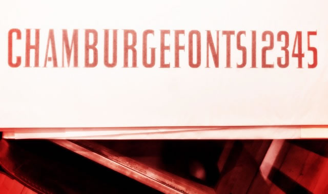


![BRAND COMPONENTRY | LINKING BRAND DESIGN VOCABULARIES, PATTERNING[S], PREMISES AND PRINCIPLES](http://www.girvin.com/wp-content/uploads/2023/03/brand-vocabularies-places_01.jpg)
![BRAND COMPONENTRY | LINKING BRAND DESIGN VOCABULARIES, PATTERNING[S], PREMISES AND PRINCIPLES](http://www.girvin.com/wp-content/uploads/2023/03/brand-vocabularies-places_02.jpg)
![BRAND COMPONENTRY | LINKING BRAND DESIGN VOCABULARIES, PATTERNING[S], PREMISES AND PRINCIPLES](http://www.girvin.com/wp-content/uploads/2023/03/brand-vocabularies-places_03.jpg)
![BRAND COMPONENTRY | LINKING BRAND DESIGN VOCABULARIES, PATTERNING[S], PREMISES AND PRINCIPLES](http://www.girvin.com/wp-content/uploads/2023/03/brand-vocabularies-places_04.jpg)
![BRAND COMPONENTRY | LINKING BRAND DESIGN VOCABULARIES, PATTERNING[S], PREMISES AND PRINCIPLES](http://www.girvin.com/wp-content/uploads/2023/03/brand-vocabularies-places_05.jpg)
![BRAND COMPONENTRY | LINKING BRAND DESIGN VOCABULARIES, PATTERNING[S], PREMISES AND PRINCIPLES](http://www.girvin.com/wp-content/uploads/2023/03/brand-vocabularies-places_06.jpg)
![BRAND COMPONENTRY | LINKING BRAND DESIGN VOCABULARIES, PATTERNING[S], PREMISES AND PRINCIPLES](http://www.girvin.com/wp-content/uploads/2023/03/brand-vocabularies-places_07.jpg)
![BRAND COMPONENTRY | LINKING BRAND DESIGN VOCABULARIES, PATTERNING[S], PREMISES AND PRINCIPLES](http://www.girvin.com/wp-content/uploads/2023/03/brand-vocabularies-places_08.jpg)
![BRAND COMPONENTRY | LINKING BRAND DESIGN VOCABULARIES, PATTERNING[S], PREMISES AND PRINCIPLES](http://www.girvin.com/wp-content/uploads/2023/03/brand-vocabularies-places_09.jpg)
![BRAND COMPONENTRY | LINKING BRAND DESIGN VOCABULARIES, PATTERNING[S], PREMISES AND PRINCIPLES](http://www.girvin.com/wp-content/uploads/2023/03/brand-vocabularies-places_10.jpg)
![BRAND COMPONENTRY | LINKING BRAND DESIGN VOCABULARIES, PATTERNING[S], PREMISES AND PRINCIPLES](http://www.girvin.com/wp-content/uploads/2023/03/brand-vocabularies-places_11.jpg)
![BRAND COMPONENTRY | LINKING BRAND DESIGN VOCABULARIES, PATTERNING[S], PREMISES AND PRINCIPLES](http://www.girvin.com/wp-content/uploads/2023/03/brand-vocabularies-places_12.jpg)
![BRAND COMPONENTRY | LINKING BRAND DESIGN VOCABULARIES, PATTERNING[S], PREMISES AND PRINCIPLES](http://www.girvin.com/wp-content/uploads/2023/03/brand-vocabularies-places_13.jpg)
![BRAND COMPONENTRY | LINKING BRAND DESIGN VOCABULARIES, PATTERNING[S], PREMISES AND PRINCIPLES](http://www.girvin.com/wp-content/uploads/2023/03/brand-vocabularies-places_14.jpg)
![BRAND COMPONENTRY | LINKING BRAND DESIGN VOCABULARIES, PATTERNING[S], PREMISES AND PRINCIPLES](http://www.girvin.com/wp-content/uploads/2023/03/brand-vocabularies-places_15.jpg)


 My remote studio, 95 miles from Seattle, the Iron Springs Park, OseanStudios, Copalis Beach